Tuesday, 31 December 2013

Worst map of 2013

Update: since I wrote this blog the author of the map concerned got in touch with some vitriol and a lack of humour citing some copyright nonsense, unprofessionalism and such like. He had a less than enthusiastic take on my writing on what remains the worst map of 2013. I guess the truth hurt and he failed to see the tongue-in-cheek approach I took to this. Despite the fact I know I am well within my rights to use the image under the principle of 'fair use' the author was being somewhat difficult. So the image is removed...but you can click on it to go to his tweets directly (wear shades). He tweets this bilge daily. yes, it is bilge. He might not like my humorous take on his efforts but make a map that bad and it deserves to be completely slated in unflattering terms.

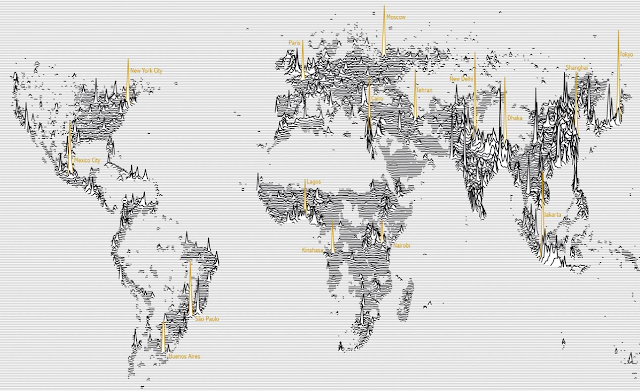
My friend and colleague Craig Williams posted this gem on Twitter and it immediately registered as possibly the worst map I have seen in a long while...and for that alone it's gone straight in as my worst map of the year (by someone other than me). So bad, it's not even in a top ten - it's in a list of one.


Colours...holy mother of all that is decent...this is out of bounds, off the hook, shut the door and throw away the key awful. Not content with a simple rainbow effort this crowbars two of the worst colour ramps I have ever seen together in one discontinuous continuous blur. A symposium of technicolour psychedelic vomit across the map. Zero or -100? -20 or 125? You tell me. Land or water? Again, tricky.

Good job they added temperature annotation all over the map so you don't need to worry about the colour...at least it would be if you could make them out. Quite a bit of overlapping annotation and black lines overprinted make that task a little tricky.  You'd like to think labels means land and no labels mean water but no...some (not all) water has labels to.

Somewhere in there is a coastline but with State boundaries also on board that bisect the Great Lakes it makes uncovering that a little cumbersome. And look at those beautiful offshore temperatures...what accuracy...what precision...each colour and one degree of temperature change gets its own contour interval. 

And zero...that's the huge cliff drop in colour across the map. How many 'white-ish' zones does the ramp go through? Well there's one at about -45, another at 0...one more at 30. Ugh! 

At least it has a title...erm, well...it has a collection of codes and characters across the top, some of which make some sense.

It squeaked in at the end of the year but it's singularly the most worthy effort of the crown of cartographic failure of the year for this cartonerd at least. The very reason that cartography exists is to prevent this sort of crap. Please people...let's try a little harder and not insist on using every single crayola.

I'm quite sure weather modellers would say they understand this nonsense perfectly well (or maybe it explains why weather forecasting is as much miss as it is hit?) but modelling the map on some Grateful Dead album cover from the 1970s is taking things too far. Actually...no it isn't...


Happy Mappy New Year to you all (except for the author of this map who has no sense of humour)


Saturday, 21 December 2013

Favourite maps from 2013

Everyone and their dog tends to publish their own 'best maps of...'. Given I spend most of my time on this blog haranguing bad maps during the year I thought I might try it myself this year so here goes, in no particular order...my favourite 10 maps of 2013. For those that are counting, there's 11 but here goes...

NYCHenge by Andrew Hill

The Manhattan Solstice occurs twice a year when the setting sun aligns perfectly with the east-west street grid in New York City. This map could not be any simpler but it captures the phenomena perfectly. Intuitive, interactive controls and a great use of colour allow viewers to explore the way in which the sun splashes across the city throughout the year. Temporal data, perfectly represented with expert use of colour and contrast.


http://nychenge.com/


Population Lines by James Cheshire

Global population density drawn as horizontal lines...almost like a cardiograph of the pulse of the world's populus. Not the first map of population that's ever been made but a compelling, alternative and fresh approach. A map that is also a piece of art and the beauty of it's design lies in its simplicity with colour used sparingly and for emphasis. There's an attention to detail that most will overlook that makes this so pleasing to view. Design is implicit.


http://spatial.ly/2013/09/population-lines/


Tornado Days by Brenden Heberton

2013 saw any number of maps made using NOAA's historical tornado data but this example did a fantastic job of going beyond the map by combining a wide range of multimedia in an innovative way.  The reader scrolls down to reveal new facts, new maps and a new layout. This heightens the interest and keeps people immersed in the rich story being told. Maps as a component of a story...expertly collated and combined with related material.


http://benheb.github.io/tornado-days/


PLUTO is Free! by Andrew Hill

A selection of maps that celebrate the release of New York City's PLUTO dataset. As you cycle through, the range of maps is well matched to each dataset and illustrated with simple, effective and eye-catching approaches. The maps were initially prepared to provide images for projection at a party but as a linear gallery, they work here to highlight not only the data but high quality cartography, professionally applied in a clean UI.


http://andrewxhill.com/cartodb-examples/scroll-story/pluto/#1


Scents of Glasgow by Kate McLean

Putting the art in Cartography; a visual art installation that combines a map of perceived smells from Glasgow during the winter of 2012 with bottled scents. The idea is to use the map, combined with 9 bottled scents to inform the culture, history, planning and climate of the city. Soap, Bovril, damp moss, sausage all represent synonymous places. The map shows the centre of the smell and how it dissipates using proportional symbols. It's art. It's c'art. It's done beautifully.

http://www.sensorymaps.com/maps_cities/glasgow_smell.html


Cloudless Atlas by Mapbox

A fresh approach to making a mosaic of NASA's LANCE-MODIS data. Rather than taking the best image of a particular place and then quilting them together, Mapbox stacked images and processed them, pixel by pixel to get the average of the least cloudy pixel before stitching it all back together to create a seamless cloud-free atlas. Completely synthetic but a great example of using generalisation techniques to create a product that is greater than the sum of its parts (literally). Beautiful imagery.


https://www.mapbox.com/blog/cloudless-atlas-with-landsat/


Global Wind Map by Cameron Beccario

Fernanda ViƩgas and Martin Wattenberg's Wind Map of the USA was one of the best maps of 2012. Here, a similar approach is applied globally for near real-time data. A mesmerizing, beautiful depiction of global weather patterns though the serene nature of the map belies the potential power and savagery of the mapped theme. Intuitive UI and some simple and useful ways to modify the view. Neat.


http://earth.nullschool.net/


Collins Crossworld Puzzle by Kenneth Gibson and Kathryn Kelly (Collins Bartholomew)

The world map...as a crossword. That makes it a crossworld. Geddit? Such a simple idea and a well crafted design with clues that broadly fit the locations of their position on the map. Sometimes the simplest of ideas can turn into the most effective of maps. Interaction is implicit. The classic black and white print crossword depiction is favoured and thankfully the temptation to colour continents was ignored. Great work.


http://www.collinsbartholomew.com/PDF/Collins%20Crossword%20Puzzle%20With%20Answers.pdf


The Next Big Spill by Lauri Vanhala

Beautiful production on this video of marine traffic in The Baltic Sea gives the map a cinematic quality. The map is the main actor but the supporting cast of captions makes it easy to understand. The map provokes a questioning approach to what you're seeing. The zooming, panning and soft-focus gives the map a strong aesthetic and the use of a sensible soundscape adds to the atmospheric approach.


http://www.youtube.com/watch?v=X9UtUzHDn4c


Restless America by Chris Walker

Proving that a map doesn't need to take a conventional form, here a chord chart shows the inter-state migration of people in the US in 2012. Good use of size to conotate magnitude and colour to enable differentiation between the States. Simple mouseover interaction means viewers don't get RSI through having to click everywhere. Trying to put this information onto a map wouldn't work as it'd be too overcrowded. This woks. Simply.


http://vizynary.com/2013/11/18/restless-america-state-to-state-migration-in-2012/


Khumbu Himal by Institute of Cartography at TU Dresden

Classic mountain cartography gets a refresh. There's a new colour scheme to go alongside the additional topographic detail derived from new surveys and satellite imagery. The lineage of classic Imhof-inspired depiction of mountain terrain is evident but the colours have been tweaked to give even clearer lines. The detail is breathtaking and although the map is abstract (the earth doesn't actually look like that of course), the colours and symbology give you an unparalleled sense of place.


http://icaci.org/map-of-the-month-122013/


I've probably missed a few but these are the ones I remember so on that basis alone they obviously registered somewhere in my mapping subconscious. Agree? Disagree?

What can we expect from 2014? World Cup Maps....probably as cartograms.


Thursday, 19 December 2013

Keep calm and study cartography

As regular readers (and critics...I know who you are) of this blog will know, this is where I point to examples of bad maps and try and explain why they are bad and why life may be that little bit better if they were improved. It strikes me, however, that this is fast becoming a complete waste of time because the tide of poor mapping is beyond endemic...beyond epidemic even. It's a pandemic. What's more...it seems less people neither want to know or care. They are content with sub-par efforts even if they contain basic mistakes.

It's one thing for the internet to provide a mechanism for people to get mapping, but another entirely when such maps are duly picked up and promoted beyond what they are capable of showing...and that's my beef in this blog.

Business Insider were guilty of this with a series of maps they made earlier this year...promoting their own cartographic ignorance (total of 808,000 views to date). This was also the case after the latest viral tweetmap (the Beyonce flawless map) was picked up by several online blogs and then hit TIME magazine online. Now we have another.

Jeff Sackmann of the blog tennisabstract.com has made an app to map ranking of players by country.

Here's a screen shot showing the top 1000 WTA players by country:


Here, then...the classic non-normalised choropleth. The data needs to be per capita. I might have mentioned this before (yawn!) and I was going to leave this map alone until anumber of blogs and then USA Today picked it up. Now to be fair, they do at least point to the same drawback of the maps but it seems to me a pattern is emerging and it goes something like this...

1. Person makes a map...it is alive therefore it is right (the internet says so and no-one's checking anyway)
2. Person self-promotes it on their own blog/site (nothing wrong with that...it's the internet!)
3. Some people look at map...most believe it because it's a map so it must be true.
4. Map becomes the modern equivalent of fish'n'chip paper except...on the odd occasion...

5. Other people in need of content to promote their own site trawl the internet for stuff happen across map
6. Said map is re-promoted on a new site to many more people (ad nauseum)
7. Any problems with the map are lost in the mists of time (the cacophony of 'Likes' speaks volumes)
8. The map is now cool so to be cool you have to like a map that is cool (hit 'Like')
9. A piece of cartography dies and...

11. Bloggers/commentators/experts (like me) get criticised for not liking the latest cool map

Just because I can...here's what the above map should look like when normalised (and on an equal area projection to avoid the visual bias caused by Mercator). I could have stuck this in an online map (to get clicky things so you can see values for each country) but no-one would have 'liked' it so I didn't go that far but I feel it proves the point anyway.


Now...if someone wants to argue that the non-normalised version tells the same story as the normalised version then I'm happy to use pistols at dawn.

I love that people make maps. I just wish more would make them properly...and even more, I'd like for those that promote maps on their own sites for their own purpose to do some basic research to figure out whether what they are showing is actually worth showing. If people reading maps are unable to tell the difference (and why should they...they're busy with their own lives and areas of expertise) then it's beholden on map-makers to make their maps right.

Keep calm and study (a little) cartography.

[update: edits to correct spellings]

Apple patents maps

Hot on the heels of Microsoft's attempt to patent choropleth maps and Apple's own attempt to patent schematic maps, news this morning from Cupertino's increasingly bizarre reality distortion field that Apple, fine purveyor of shiny consumer electronic wet dreams, has filed a patent application for 'layered maps'.  I'm surprised no-one has thought of this...

Marshall Island stick charts
John Snow's map of cholera
Minard's map of Napoleon's March to Moscow
a small matter of GIS (talk to Roger Tomlinson for starters...there are others who could advise)
Google (et al.)
every map I've bloody well made
pretty much every map anyone else has every made

...all prior art for the layering of layers of data, in map form, that provide a rich environment in which to describe and answer spatial questions. Technology has changed and we now do this mostly using layers from internet derived sources...quite often mashing them up using apps to generate new information. Bang goes the crux of their terrific idea. Ya boo sucks.

End of. .

P.S. I'm still trying to find a way to file a patent for crap chLoropleth maps...but everyone's making them.