I had the pleasure of working with Mamata Akella when I first started at Esri. Mamata went on to work for the National Park Service and is now at CartoDB where she seems able to flex her design wings with thematics. This is fertile space in mapping in general and it seems never a week goes by without someone re-inventing a thematic mapping technique, occasionally with a new twist. Mamata's latest map caught my attention.
In response to her call for comments I hope she won't mind me using this blog as a space in which to offer my opinion and insight so here's a critique of the map above.
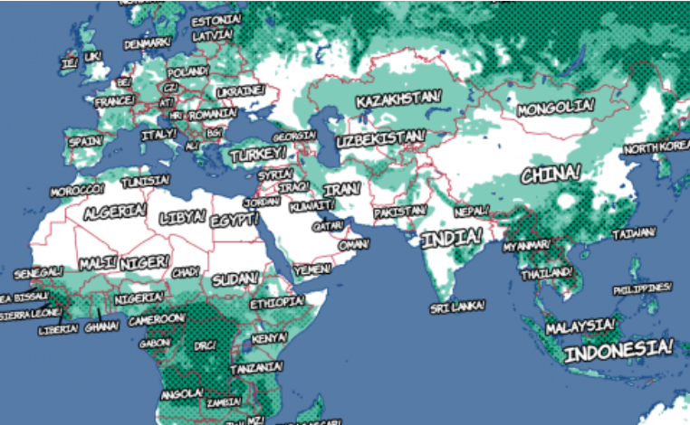
It's visually arresting. It's one of those maps you immediately stop and look at so it does a great job of getting people to pause and spend some time with it. That's probably the point so it's already done it's job. Because it lacks a title or any popups or marginalia one quickly gets lost though. As Mamata explains, it's a test and, no doubt, not designed to be used as a fully fleshed out project but it would be useful to include the basics.
It's the 2012 US election data. A well worn dataset that's just about exhausted most techniques. I spent some time with it myself a couple of years ago creating a
gallery of various thematic map types. But with the 2016 election on the horizon many will be experimenting with new or modified techniques to prepare for that mapping extravaganza (me too...but you'll have to wait for that).
So what's going on in this map? Mamata calls it a 'modified cartogram'. Symbol size is total vote. Colour is the winner (red=republican, blue=democrat). Units are counties.
First off - I like the appearance and I like that it's in an equal area projection (Albers). It's eye-catching and somewhat different. I then quickly get uncomfortable with the function and how the data processing encodes meaning. Clearly the real geographic boundaries have been processed. My sense is a regular grid of rectangles has been used in which to bin the counties that fall within. That explains the regular grid and also the irregular number of symbols per location.
Geographical boundaries have been replaced by an abstract geography. It's referred to as a cartogram, likely because of this abstraction but a cartogram it is not. Cartograms distort space but they don't aggregate in an irregular fashion. Think
Gastner-Newman,
Dorling,
Demers or a basic
non-contiguous cartogram which all treat geography in different ways but which do not apply a binning technique as an interim step. Further, cartograms don't have overlaps. Mamata's symbols do overlap. It's therefore difficult to know how many counties are represented by each location and it's difficult to ascertain the distortion of the underlying geography which will inevitably be greater in areas with larger numbers of smaller counties. It's adding in a visual complexity that isn't necessary even though it gives a neat (as in regular - pleasing to the eye) looking final appearance.
I don't particularly like the way transparent overlaps on the symbols yield overlaps with darker shades - to me that visually implies 'more' yet is purely an artifact of symbol size bleeding into an adjacent symbol and not necessarily a function of geography at that place or overlapping geographies. Of course, when we're talking about mixing blues and reds it gets even more difficult to visually disentangle. That''s not a problem simply on this map though. I wrote about it
before in regard to proportional symbol maps.
So it's a gridded proportional symbol map? Looks that way. Are symbols stacked? Possibly - in which case a lot of colour is missing due to occluded symbols which changes the ratio of blue:red colour across the map as a whole. If the data is really represented as rings then OK, we're seeing everything but it's also hard to determine why some symbols have more transparency applied than others (strength of vote?).
There's no labels which makes it difficult to describe the pattern verbally and causes even more problems if you don't actually know this is the USA. When you zoom in, the map refreshes with some very big changes in symbol size and larger white spaces so the structure we see for the whole is lost. This makes it hard to retain a mental image of pattern at one scale and compare it to that at another and we very quickly lose where we are on the map.
If it's a proportional symbol map then why not just use geography, even if you discount the boundaries and make a
proportional symbol map?
I'll tell you why - they just ain't sexy enough in today's modern mapping landscape. So that's why Mamata experiments. It's why I experiment too. Sometimes we hit, sometimes we miss in our search for something just a little bit unique to develop cartography and showcase the tools and technology of our trade.
For my money this is a miss. I like the look but I think it complicates the subject matter and confuses the cognitive process of understanding the patterns in the data. For me, form should never outperform function. Cartography really is, at its very essence, that art and science of marrying form and function in harmony. You've got to get both right to make a good map.
Back to it being a cartogram - no. It isn't. But maybe Mamata's created a grid-O-gram?
Update: Inevitably, whenever I do one of these critiques I get called out for it being on a map made by someone who works somewhere that I don't. First, Mamata asked for comments. Second, I couldn't care less where she works and this IS NOT about the tech she used. None of my critiques are about the tech. It's about the cartography. Sure, tech affords opportunities or constraints but I don't care one bit about who uses what. This is not about scoring points. I don't publicly critique maps made by colleagues at the place I work because there are better mechanisms for me to use to try and effect change from within. And surely, if anyone thinks it's a good idea openly calling out your employer and those who you work with, you must work in an incredibly forgiving place. I do call co-workers maps out all the time using appropriate avenues. They critique mine too...often in very stark terms. Critique is good. Using different mechanisms to get the job done is important for cartography whomever you work for. So - don't get irate just because Mamata and I work at different companies. It's irrelevant. And yes, many maps I see made by friends, colleagues or whomever are truly awful and I tell them that. Silence in a public space can often be deafening.