Saturday, 8 December 2012

The Mystery of the Grey Line

Some debate at the office this week after a mysterious light grey line appeared on Google Maps from the Salton Sea to Monterey Bay that ran right over Redlands. Nothing better than a mapping curiosity to divert attention from work. So what is it?


Here are a selection of the theories on the mile wide feature:

  • mis-aligned administrative boundary...but there aren't any that shape or position nearby
  • San Andreas fault...but it only matches part of the fault's position and why would it be symbolised like this?
  • a little known boundary accidentally symbolised too large
  • a planned new high-speed public transport rail link (huh? in California...c'mon!)
  • a newly found subduction zone
  • a pipeline (well, it does disappear under the San Bernardino mountains)
  • a planned pipeline
  • an irrigation ditch
  • new river to drain what's left of the Salton Sea
  • a spatial reality distortion zone that just happens to fall across Redlands (think about it...)

The answer, thanks to a friendly Google man in the know: probably a rendering bug. Simple. Back to work...fixing our own rendering bugs ;-)

Bomb Sight Map of the Blitz

The Bomb Sight project recently went live, presenting the London WWII bomb census between 7.10.1940 and 6.6.1941. It's a terrific effort (kudos to the team), cataloging anti-invasions sites, bomb types and adding an overlay of the bomb maps themselves.  The map is the result of a year's worth of work which hints at the effort needed to build an interactive web map with good quality content...it's not a trivial task! Just a few words on the cartography...

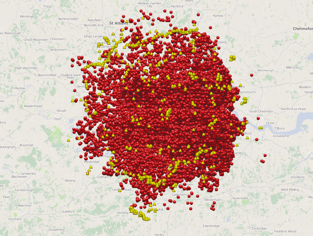
Given the sheer magnitude of the number of bombs at scales smaller than about 1:72k the map descends into an inevitable push-pin madness.  Now I can understand the point of this is perhaps to create a stunning visual impact of the sheer scale of bombing (and the word Blitz has never been more appropriately illustrated) but there are more useful ways to present the data.  Binning into geometric shapes (hexagons, squares) would create a summary overlay.  Some form of interpolated surface might also summarize the data better at these smaller scales. The scales could, of course, be constrained to avoid the map being able to zoom out too far. I'm in two minds over this...it's probably the only example of data which isn't fundamentally destroyed by the amorphous blob of overlapping symbols simply because of the subject matter. Certainly, the scale of the Blitz is illustrated with a frighting clarity even though, technically, clarity is not usually supported by push-pin overload.

Bomb sight map at 1:577k

At 1:72k even though there isn't interactivity it's fascinating to see the patterns of bombing runs (clearly seen in the screen grab below).  It might be nice to code the symbols somehow to indicate they were part of a single run (perhaps a thin line to join related dots)....possibly at scales 1:36k and larger.

Bomb sight map at 1:72k

Zooming in further, the contrast between the subtle basemap and symbols is well crafted. When you zoom to the largest scales (1:4k) the symbols change from generic geometric shapes to pictorial designs and multiple bombs at a single site are presented as numerical markers that literally explode into component parts when clicked to reveal individual sites.  At 1:4k the map now allows interaction with each symbol containing a popup with basic details and a link to much more detailed information. The map works really well at these scales but I'd like to have seen interactivity developed at smaller scales. Given people's propensity to move away from web sites rapidly, it would be useful to incorporate interaction earlier to avoid them leaving the site before the good stuff....I found myself clicking around at smaller scales to prompt some form of interaction which is only rewarded once you have reached 1:4k.

Bomb sight map at 1:4k

There's some useful filters in terms of layers you can switch on or off and you can isolate the first night of the Blitz with a nice bar graph. The ability to search by neighbourhood, view other statistics and ancillary information, images etc is a great way to support alternative forms of inquiry and further mining of the information. The cartography could have supported the interaction further though. The popups could present the date as well as the place.  The data clearly has a temporal component so it shouldn't have been too difficult to provide a time slider allowing users to cycle through by date, or even play an animated version. The Android app version adds in functionality to use the phone's location to zoom to the local area and an augmented reality mode that supports the overlay of bomb details as you wander round. Neat!

Overall a really great example of how a web map can be used as a portal to archive material and how the map is part of the overall presentation which works well when you have a rich dataset. In my opinion, some tweaking of the cartography would help...not to make it 'pretty' but to summarize the data better at certain scales and make the map more effective across scales rather than only at larger scales. The point here is really to emphasise that a multiscale web map is really a series of individual maps that has to function at each scale. The bomb sight map works brilliantly at some, but less so at others which impacts on the consistency of the user experience across scales. Building a multiscale web map requires careful planning of each scale along with a clear idea of the transition of data representation, symbol design and interactivity across scales. There aren't many that get the balance right but this web map is certainly one of the better examples.

Monday, 26 November 2012

LGA National Map of Shared Services cartojunk

This one from @StevenFeldman who is seemingly learning that pushpin maps are not actually that good.  It's taken me a while to persuade him that applying some design KnowHow (to add to his KnowWhere) is a really important part of the data dissemination and communication process and this example from the Local Government Authority web site is a perfect example.


I'm not going to go on and on but here's the thing...when you click on this map some really useful information appears but:
poor symbols that don't differentiate
poor reference backdrop that just adds visual clutter
overlapping symbols at small scales that just creates visual noise

The map needs far more nuanced design to enable it to operate as a multiscale information product.  Some form of aggregation at small scale that then proper symbol design to differentiate meaning between different classes. Maps like this are lazy.  Yes, good maps take time to create but this sort of map does a disservice to the information behind it. Who will stay to interrogate this map? Answer...very few...they're off to another web site.

The Economist ponders map types

The Economist recently asked for reader opinions on the types of map used to portray the data it uses. It focused on the choice between cartograms, choropleths and proportional symbol maps.  I added comments which are reprinted below but you should read the original article here first.


Poor mapping gives the wrong message. Most are unaware of map theory so mistakes go unnoticed; misinformation is propagated. That said, asking readers their opinion is like a doctor asking a patient what medicine they prefer. The doctor has the conferred expertise to make a sound judgment.  The same is true here so my comments are based on my professional experience to add to the mix.

Population equalized area cartograms are impactful but difficult to decipher because of massive distortions.  We’re atuned to see our world in a particular way (normally through the hideously distorted Mercator lens) so when familiar shapes are further modified we struggle.  Numerous alternatives use circles, squares, hexagons and non-contiguous areas which gives choice.  I like cartograms but am used to them, know how to construct them and don’t have difficulty in deciphering the content.  They work best for global datasets where continents can be seen.  For headline grabbing infographics then a cartogram is hard to beat but one way of giving readers visual comfort is to add a second, smaller map using a more conventional method for comparison.

Cartograms rescale geography to account for differences in size of areas used to report data values.  If a conventional map type is used that maintains geography, this difference often isn’t accounted for and the map is worthless. The classic example is the choropleth that maps totals. Consider the number of medals that Team GB won at London 2012.  Greater London has a population of 8278251 with 10 medal winners (0.12 medals per 100,000 people). Cardiff has 346100 people and 4 medal winners (1.16 medals per 100,000 people).  A map of totals shows Greater London as visually dominant and Cardiff much less so when the reverse is true. Normalized results allow proper per capita comparisons across the map that account for underlying populations.  The classification scheme used is also vital as it can dramatically alter appearance. There are many choices (natural breaks, equal interval, quantile, standard deviation etc.) and each dataset requires exploration to avoid imbuing false patterns.  Choropleths are bland but they do their job. Make good use of other design principles to combine functionality with a useful aesthetic.  Your colours are poor. Green for non-export markets confuses and neutral grey would be a better choice.  You use light peach, through orange/pink to a heavily saturated red last seen during the cold war on propagandist maps! It’s visual noise. Adding Catalonia in burgundy makes it seem part of the choropleth spectrum yet isn’t. Good colours go a long way to making the map work. Legends are important to see the classification scheme but the map should be able to tell the headline story without one. All choropleths suffer from dominant large areas so where possible use an equal area projection; and inset maps for those parts of the map that contain small geographic areas.

Your proportional symbols are too similar, leading to the impression that exports are similar.  Greater variation in symbol size would help.  Transparency deals with overlaps but won’t always work where large data values occur in smallest areas. Colours could be improved and a neutral background would help with contrast. Humans aren’t good at estimating differences between areas.  How many people can accurately tell if one circle is double the size of another? There are ways to adjust for our underestimation but which introduces further complexity.

You might consider dot density, dasymetric  or, for this subject a flow map would suit.  Flow lines from Catalonia to neighbouring countries could be scaled by width to indicate proportions.  My rudimentary reworking of Minard’s flow map of British Coal Exports shows how flow can be represented. If you’re presenting maps online then consider hover and click events to reveal data values or additional information. This pairs back the map to essential graphics while allowing people to delve into the content interactively.

So the answer isn’t straightforward.  Consider each dataset independently of preconceived ideas about map type.  Think about the story you want to tell to inform your choice.  Once chosen, the next trick is to design it to work effectively and marry form and function meaningfully.  This isn’t easy and is the main reason why so many poor maps are made. Sometimes a table or a graph is much more useful.  Sometimes you might combine graphs with the map or combine map types. The map should be informed by a decisions that bring together useful graphic components in a well-thought out composition. There’s no substitute for looking at how others tackle thematic cartography. Learn what works, understand what doesn’t and your maps will evolve into purposeful products regardless of map type.