Tuesday, 12 November 2013

To react or not to react. That is the question.

It seems I've irked Mr MacWright again with my latest blog about the police.uk crime map.


He's even gone to the effort of cataloging my blogs and creating a taxonomy of alleged anti-MapBox sentiment:


A little scary but kudos for the effort! Odd classification though. I try not to focus on any platform but, rather, look at specific maps so using my blogs as an anti-MapBox metric is being a little mendacious.

This is a blog that voices constructive criticism about maps...that's the point. That's what the internet does - provide a place to share thoughts and ideas.  My intention in the blog is to challenge people's ideas of how maps work by pointing out their weaknesses. Not everyone will agree but it's my blog and I stand by the comments. When I can, or time/data permits, I even rework maps to show how I feel they may be improved. Choose not to read if they offend but making the assumption this conduit is my only voice is a serious misrepresentation.

I speak at many events. I write and publish. I perform numerous critiques in my role at work and these are forwarded to the appropriate persons using the appropriate form.  This blog allows me to explore publicly visible maps too. I could choose not to but there are already too many people who tacitly accept any map the internet pushes. This blog is but a fraction of my contribution to cartographic discourse, both positive and negative (though I prefer to see it as constructively pointing out limitations rather than just being negative for the sake of it). It's also true that silence often says much more than words so sometimes it's simply best not to use social media as a vehicle and choose a less public form of interaction instead.

My take on the maps I use as a basis for comment is to see how the message suffers through poor cartography. The same is true for the crime map blog which is very positive about the technology underpinning it but the message the map delivers is flawed.  I struggle to see how one might come to the conclusion it was negative about MapBox per se.

I don't criticize the work of my colleagues via my blog because I strongly suspect my employer would be somewhat displeased. I wouldn't imagine this is a situation unique to me. Internally, comments are shared. I am also very critical of my own maps where I cannot necessarily achieve what I might want. It's really up to others to provide critical commentary on my work (which I would encourage)...and they often do which is what helps in trying to improve my own work.

There are many ways to influence change in trying to improve how maps communicate and my blog is one piece of a much larger jigsaw. You have to see the whole puzzle to get the big picture. Take my tweets for instance...there's probably a fair split between sharing or commenting on good work as their is sub-par work. I've certainly been pretty positive in tweets over the last few months about many initiatives coming out of MapBox, CartoDB, d3, the open source community and a host of other stuff.  I was the author of a very popular blog on the Esri web site explaining how those using ArcGIS Online can consume their MapBox maps as an alternative to the Esri offerings.

Do good work. Share it. Take critical comment in the right spirit. Set up parody Twitter accounts. Use your right of reply if you want.

To react or not to react: that is the question:
Whether 'tis nobler in the mind to suffer
The slings and arrows of outrageous tweeting,
Or to take arms against a sea of misrepresntation,
And by opposing end them? To blog: to tweet.

Monday, 11 November 2013

Oh crikey!...it's the rozzers!

Police.UK just published an updated crime map.


They've been hard at work over the last couple of years since the original version which was released in February 2011.

OSM. Check
MapBox.js. Check.
Leaflet. Check.
Dynamic cluster markers. Check.
Neat customisable search area. Check
Clean UI. Check

Yep, they've got all the latest tech driving the map and in respect of the UI/UX it's a clear improvement but has it improved in terms of what it offers the casual user?  I wrote a blog on the first map and pointed out a few cartographic issues with how the data was misrepresenting geography and crime...so what's changed?

Nothing. Check.

It's a new face on an old map. The data model is the same as before...crimes are aggregated to a generic locator placed on a road segment. Only when you click on the marker symbol do you get a breakdown of crime type (and only when you're zoomed well into the map). I can filter by type but that just updates the number.  Why hasn't the map been designed so I can easily 'see' the patterns? Why make me have to interpret numbers?

Why aren't the symbols scaled properly...look in the image above. 1 crime is the same sized symbol as 8. 286 only marginally larger. This is a false picture visually and perceptually. Did 286 crimes really get committed 'here' as it says when you open the popup? Of course they didn't. They occurred across an area. So what area is that and how can I see it? This is a perfect example of the Modifiable Areal Unit Problem at work. Every number in the map is a function of the size and shape of the reporting area. What are these? It's important to understand them to gauge how those arbitrary areas affect the pattern you're seeing. Small numbers appear on smaller roads and larger numbers on larger ones...so the reporting seems to have a relationship with the nearest road and of course you'd expect more crimes over longer roads covering larger areas.

And here's the sting...unless those numbers all relate to equally sized areas, or they are on an equally spaced grid the map is clearly falling foul of that age old problem of not normalizing your data to account for differently sized enumeration areas.  I have no problem with proportional symbols of totals being used as long as I can see what the pattern of the enumeration area is...but without it I have no idea how the map is being shaped whatever slick interface I have to navigate.

My previous comments about version 1 stand...the proportional symbols are weak and suggest absolute location as well as the uncertainty of the underlying enumeration geography not being visible. Why not use a proportional linear symbol for the entire road rather than suggest all crimes occur at that specific point? Better still...why not symbolize the reporting areas to give us a truer picture of crime across space? Are area maps just not sexy enough any more?

Is this a question of the data being generalized to a nearest point or is it the mapping trying to introduce some fuzziness so as not to be too accurate in identifying specific locations? Either way, the map locates crimes at points that don't actually locate crimes and probably fails to show us the true pattern. It's a dangerous story to tell. It's also laziness...the data are most likely reported to a nearest enumeration point and that defines the map. No attempt to process it into something more meaningful.

As readers of Treasure Island know full well, X didn't actually mark the spot where the treasure was buried...and this national map of crime perpetuates this myth by showing inaccurate locations. I look forward to version 3 in 2016 when they might actually address the data and cartographic issues of the map rather than just the cosmetic.The KISS principle used to mean "Keep It Simple Stupid" but now seems to be more appropriately "Keep It Slick Stupid".  UI/UX is not the same as cartographic design.


Monday, 28 October 2013

What price cartography?

An advert caught my eye this morning for a 12 month maternity cover post as a Cartographic Assistant in Cambridge UK. Salary? £14,000 (maximum) per annum plus a few odd benefits like a clothing allowance (map ties?). Now before I get carried away I appreciate this is for the post of 'assistant' and it's a non-permanent contract but...

That salary is derisory. In my last few years as a lecturer at Kingston University it was becoming increasingly difficult to attract wannabee degree students to courses that blended GIS with mapping and computer science.  Mapping has become so pervasive that so many presume it's largely something that just 'happens' and the job market reflects that; there can't possibly be a worthwhile career to be had; and surely it's not worth dedicating three years of study on. We also worked closely with the geo-industry and the story we got from them is that they were finding it increasingly difficult to recruit graduate level talent with geo-skills. Sure, plenty of geography graduates who can staff the local McDonalds but not that many with the skills for a modern mapping job.

When you see derisory salaries such as this you can easily see why the industry is not attractive to people deciding what to choose for their degree and possible career path. A quick look at what graduates earn reveals an average graduate salary of £21,762 and an average non-graduate of £14,801. Geography graduates slightly below average, Computer Science slightly higher. Big bucks for Engineering, Medicine, Dentistry etc... There's clear value in getting a University education and that's without taking account of future earning potential.

Why then, is cartography relegated to the non-graduate pile, particularly as the world now more than ever needs people with skills in understanding and communicating spatial information and who can both build and harness the amazing new mapping tools we have? For what it's worth, my perception is still that far too many sorely underestimate the value they place on quality mapping. They don't really understand what it means to be a cartographer, what it entails and see it as a relatively low-skilled position. We've all heard the jibes about "hasn't the world already been mapped" and that attitude pervades but if companies really want to get serious with their mapping they need to hire people who know what they are doing and can do it well.

So the company advertising this position clearly sees cartography as a non-graduate role. Little wonder, then, that it's tough to persuade people of the value of a University education in GIS/Mapping or a related subject. Cartography, then, will continue to be classed as a largely unimportant and poorly paid job. I pity the person who takes this...a quick look at the Cambridge rental market reveals an average rent of £1,135 per month. Good luck living off your spare £380 for the year...oh, wait, that rent doesn't include Council Tax, Utilities and lattes...debt here we come!

Thursday, 24 October 2013

A touch too much on house prices

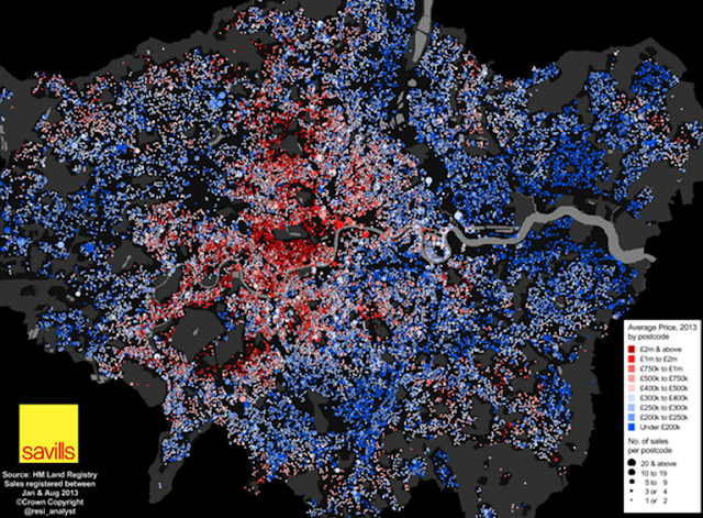
Neal Hudson (@resi_analyst) just published what he describes as a 'detailed map of London house prices':


Neal's map struck me as an example of a breed of maps that are becoming pervasive online simply by virtue of the fact that large datasets are more accessible. Is that a problem? No...quite the opposite; the potential for making maps has never been greater though the default approach to mapping large datasets is simply to throw it all on the map.  A few years ago this map would have been on a Google basemap with a smothering of red Google markers.  We've certainly progressed and Neal's done two things...coloured the symbols to denote average house price and sized them to denote the number of sales. I think he's gone too far.

The number of bits of data you have doesn't make the map 'detailed'. It just makes it 'a lot'.  Detail can only be seen if the map's content is legible and so much of it masks itself. We get a broad idea that there are concentrations of higher house prices but that's about it.  Where's the context? I know that the areas without any dots are predominantly parks so it's no surprise that higher prices are evident around Hyde Park, Regent's Park or Richmond Park.  It's also no surprise that there are lower average prices around the Lee Valley, Heathrow airport or the Thames estuary but unless you know the geography you have no hope of being able to describe the pattern and explore possible relationships with environmental or socio-economic circumstance. So the map sparks interest but you can't actually explore any questions you may have.

I also wonder if removing the house price sales variable and just showing the average house price would be a better idea? Do these two variables actually make sense on the same map? I get why they would but encoding too much in one map is sometimes a touch too much for the map to be able to handle. The symbols are inevitably competing for space because postcode areas in London are small. As soon as the decision was made to map number of house sales by varying the symbol size the problem became almost unmanageable. Sticking with one variable and keeping the map simple might have made the message more striking.  Making two maps, side by side may also show some interesting patterns that combining the data masks.

Couple of other carto-quibbles...the red-blue dichromatic colour scheme is clearly a default and going through washed out colours in the mid-range does nothing for the map...but hang on...why use a dichromatic scheme in the first place? The symbols vary around £400k. Is this the average of averages? What is the importance of this critical break in the symbols? I'd wager nothing...so the map would probably work better with a single hue scheme. And what of some other context? How does the London bubble compare to the rest of the UK? Even at the lower end, most London houses are probably more expensive that the average for the rest of the country which might be a useful comparison to state. Finally, and I'm getting into cartonerd detail here...overlapping classes in the legend just needs modifying to avoid the same value appearing to lie in two classes.