
In 2014 I wrote a paper with Professor William Cartwright that was published in The Cartographic Journal entitled 'Becksploitation: The Over-Use of a Cartographic Icon' (preprint here) We played devil’s advocate as an attempt to provoke and promote debate about the legacy and ongoing use of the Beck model for transit mapping. And in conclusion, we summed up our critique by calling for a fresh start, a reset of the London map to overcome many of the problems that the current map faces as it simply tries to update Beck’s ideas:
“We’d like to encourage a return to thought, experimentation, drawing and testing as a way of discovery and the search for the next great map style. Beck made a cartographic icon for one purpose – to navigate the London Underground; a perfect map made at a perfect place and time. We need new, fresh and challenging maps.” (Field and Cartwright, 2014 p358)
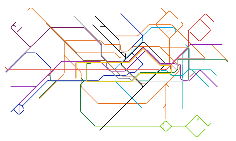
And that problem begins with the current London Underground map which has become a model of how not to iterate a map which had its day nearly 90 years ago. The original map is a piece of perfect cartographic design and undeniably useful for navigation and wayfinding. It’s debatable whether the current version is useful any more. Beck's brilliance was to omit above ground detail, creating a schematicised map with huge distortions in scale and real-world location. The colours were coded to fit the wider corporate design aesthetic and he used straight lines for curved railways – horizontal, vertical, 45° which were also indicative of speed and efficiency of the network. A practical outcome as much as a brilliant design statement.

And this is the current map (link to TfL maps) showing the massively increased network of interlinked services but which still retains the same basic principles that Beck brought to the map.

In my view (and that of many others) it’s lost its way. It’s full of clutter. There’s still elements that need to be retained – the typeface and colours are intrinsic to the look and feel of the London map in my opinion. But the lines are disorganized. The amount of detail overbearing. The station tick marks might be due for retirement and the interchange symbols might be modified. Representing accessibility has become a preoccupation for Transport for London but it may be better off the map, in a list of stations. And what of the British Rail symbol? – is this really so useful for foreign tourists for instance? Can that be redesigned? Do we have to show intermittent services on the map? After all, there’s a separate map for night services now and there's no sign of those services on the main map. Some interchanges have become terribly congested.
In summary – it was about time I put my money where my mouth was and had a go at a redesign rather than just moaning at the map and what it has become, not to mention some of the redesigns I've not warmed to particularly. And it's worth noting at this stage I'm not the first and I won't be the last.
The idea was simple, start from scratch, and if you're making a schematic, it's a diagrammatic approach and you need a grid to start with to give the map order. A grid that tessellates such as squares, triangles or hexagons. I’ve experimented before and was almost settled on a hexagonal grid but there was just something aesthetically that I didn’t particularly like. Too messy.

So I settled back on using squares because it just seems to fit London quite well. And because I wanted to begin by physically ‘sketching’ I built a peg board. A piece of board with 800 nails at 3cm intervals to create my scaffolding.

And I bought some thread and began to make my tube map from scratch. The beauty of this was that the physical process meant I could rapidly re-route as I encountered issues and difficulties, but I was trying to be a little more geographical so, for instance, the Northern Line actually doesn’t go vertically north as it does on the official map, and many others. So I began with that as an anchor, but it moves more north-westerly. And the Central line remains quite well served by remaining broadly horizontal. One of the key differences I wanted to establish was a better relationship between the above and below ground. Yes, this would be a schematic, but I wondered if I could keep the key physical feature, the River Thames geographical. I was also trying to build a map that could support an experimental 3D version where I could fit above ground detail into the intervening spaces.
And this is what I ended up with, about 30hrs later.

I won’t bore you with the process of generating the digital version but I effectively brought digital photograph of the peg board into ArcGIS Pro, georeferenced it, then build a digital peg board and traced my map. I wrote a blog about that whole process as part of my day job if you're interested in how to make this yourself.

Of course, dealing with digital thread that used the same nails as vertices was the next challenge so there was plenty of offsetting lines. But I ended up with this basic layout:
There’s significantly fewer changes of line direction compared to the official map. There’s a similar density of linework but I feel the strong central diamond of the Northern Line within which others nest in and around brings the eye back to the core area of the map. In my opinion it’s a cleaner network. Less spaghetti. Crisper perhaps? Yes it’s still intrinsically diagrammatic but perhaps better balanced. The central area is a little more rectangular in overall appearance.
Let’s take a closer look at some of the design decisions. I retained the horizontal, vertical and 45° lines; TfL colours. Johnston typeface, but now in a more muted 70% black. These are all decisions that give the map 'the London look'. I omitted river services, accessibility detail, limited services, and fare zones which to my mind are simply clutter. They just do not need to be on THIS map and can be better presented in other companion products. At some point you have to make the decision about what MUST go on the map. Omission is the most under-used cartographic tenet yet it is vital to deliver clarity in a final product.

I changed the line symbols which are now cased which helps with establishing separation between adjacent lines and for where lines cross. The British Rail symbol replaced by a different national rail interchange symbol. Station symbols are replaced by white (negative) space and within the line to leave more space for labels and other content. Interchange symbols follow the same basic structure but with an internal 70% black symbol. Interconnectedness is implied by adjacent symbols ‘touching’.

Walking symbols replace the pecked lines on the official map which I think are more intuitive. I also simplified many of the junctions with fewer overlaid symbols, for instance here at Earl’s Court. I also used line folds into a single symbol at terminal junctions. In some respects this new map respects geography a little better. The wayward northerly direction of the western edge of the Central Line has always bothered me. Yes, it veers north a little but I managed to straighten it out and return it back to the horizontal line on Beck’s original 1933 map.

I would also argue that my mainline London station connections are far more streamlined than the official map’s counterparts (comparison for Paddington below).


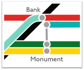
Though early critique of my use of a different way to represent national rail connections proves how iconic embedded symbols can be in our minds eye. I was trying to avoid the old British Rail symbol but I may end up going back to it, or something else. Simple connectors are used for complex interchange stations like Bank/Monument.

I think this comparison, perhaps more than any shows that I think the time has come to dispense with large, bulky, black cased interchange symbols. We can make a more elegant map. And I managed to get a geographical River Thames into the design which I believe gives the map a sense of realism rather than the stark schematic. It’s tapered – like Beck’s original and a feature that has also been lost in the mists of time. I carried the diamond motifs to the four corners of the map which helped tidy up bits of line going off in all directions – a bit contrived in places but, well, why not. After all, it is a 'diagrammatic map' And here's the final (first iteration) of my effort:

You can download a copy of the map here as an A2 poster. It’s designed for paper because…paper.
The basic form of the new map takes a traditional planimetric form that I think gives it a cleaner result, with less map furniture to get in the way of the basic task of getting from one place to another through the network. I firmly believe that omitting a lot of extraneous information, that can be better delivered in other forms, frees the map up, lets it breathe and reduces the need for seriously thinking about having to make the map A3 or A2 simply to fit detail on. The idea of a pocket map can be retained with this omission of detail.
But the intent was always to go beyond this and experiment and for that we go 3D. Now let me be clear, I’m a 3D sceptic and I firmly believe that there needs to be a good reason to go to 3D that simply cannot be supported by 2D. But my assertion here is that Beck's original idea of omitting above ground detail on the basis that the traveler doesn't need to know it seems a weak argument. Do I intrinsically know that to go from the London Eye to Stamford Bridge, I need to go from Waterloo to Fulham Broadway?
And I’ve always been fascinated with this sort of map:

It explicitly lays out the line but manages to incorporate the above ground. This was created by a small mapping firm, Global Vision Mapping in 1995. The original is 8ft tall. This, to me, is a magical map because we have ways to relate the below with the above-ground. But there are still issues because the use of perspective means that the foreground is in the foreground and illustrated far more prominently. This is how we see reality, things nearer to us are more prominent in our field of vision. Things in the background are distant and smaller. And of course, this map and many like it are laid out geographically as the Piccadilly Line meanders into the distance. And so, when I flip the schematic we see the same problem.

Here, viewed from the south west, Heathrow is prominent, the central area becomes congested once more and the north east is way off in the distance. This simply doesn’t work, and I’ve not even tried to add any detail. But there is a potential solution and that involves taking a cue from this map.

It's the View and Map of New York City by Herman Bollmann, 1962. The map exaggerates widths of streets to create a perfect amount of white space in which buildings sit. The dense fabric of the city is represented at the same time as giving clarity to individual buildings. Vertical exaggeration is used to give a sense of the skyscrapers soaring. In many respects it’s also a schematic. So what if we apply this idea to the tube map?
Here goes…

Here's my planimetric map flipped into an axonometric 'parallel' projection. Weird? Zooming in gives a sense of how the lines, which are now represented as tubes in 3D, sit.

In this configuration it makes sense for the labels to now sit at a 45° angle. This idea is not without some obvious difficulties such as where lines that previously had vertical separation now cross one another. It’s OK where there’s an interchange but not where there’s not. But we can begin to populate the map with points of above ground interest. After all, people often want to go between real-world features and not just (often) abstract place names.

And here's the final version of the map, well, a first iteration at the very least.

You can grab a larger version of the map here. It's not perfect I know. It's a bit of an experiment.
In summary, the new planimetric map undoubtedly shares some characteristics with Beck’s original and also with many other versions. This is largely due to the fact that it’s the same underlying network. Any solution that seeks to create a diagrammatic version of a transport network will share characteristics and a lineage that extends back to Beck, and others.
Physically sketching (via the peg board) has allowed the planimetric map to form organically which I believe overcomes some of the limitations we may have if we over-prescribe graphical demands on structure.
Finally, I believe I've made a map that adds a new approach by borrowing from other cartographic work that lends a different aesthetic to the mapping of a transport network. The axonometric form of the map portrays the network in a way we’ve not seen. It needs work but it's just...

Thanks for reading!
No comments:
Post a Comment