
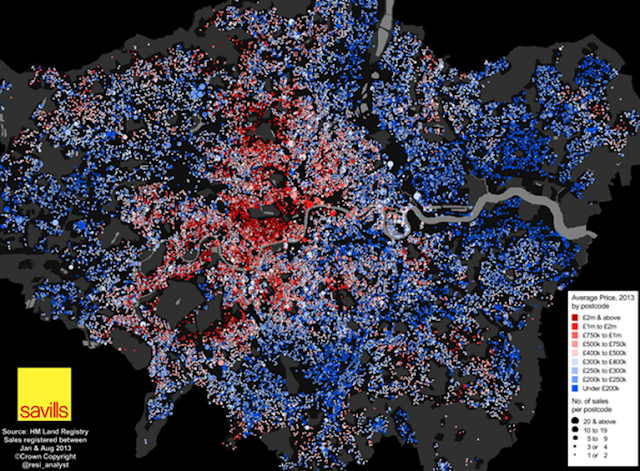
Neal's map struck me as an example of a breed of maps that are becoming pervasive online simply by virtue of the fact that large datasets are more accessible. Is that a problem? No...quite the opposite; the potential for making maps has never been greater though the default approach to mapping large datasets is simply to throw it all on the map. A few years ago this map would have been on a Google basemap with a smothering of red Google markers. We've certainly progressed and Neal's done two things...coloured the symbols to denote average house price and sized them to denote the number of sales. I think he's gone too far.
The number of bits of data you have doesn't make the map 'detailed'. It just makes it 'a lot'. Detail can only be seen if the map's content is legible and so much of it masks itself. We get a broad idea that there are concentrations of higher house prices but that's about it. Where's the context? I know that the areas without any dots are predominantly parks so it's no surprise that higher prices are evident around Hyde Park, Regent's Park or Richmond Park. It's also no surprise that there are lower average prices around the Lee Valley, Heathrow airport or the Thames estuary but unless you know the geography you have no hope of being able to describe the pattern and explore possible relationships with environmental or socio-economic circumstance. So the map sparks interest but you can't actually explore any questions you may have.
I also wonder if removing the house price sales variable and just showing the average house price would be a better idea? Do these two variables actually make sense on the same map? I get why they would but encoding too much in one map is sometimes a touch too much for the map to be able to handle. The symbols are inevitably competing for space because postcode areas in London are small. As soon as the decision was made to map number of house sales by varying the symbol size the problem became almost unmanageable. Sticking with one variable and keeping the map simple might have made the message more striking. Making two maps, side by side may also show some interesting patterns that combining the data masks.
Couple of other carto-quibbles...the red-blue dichromatic colour scheme is clearly a default and going through washed out colours in the mid-range does nothing for the map...but hang on...why use a dichromatic scheme in the first place? The symbols vary around £400k. Is this the average of averages? What is the importance of this critical break in the symbols? I'd wager nothing...so the map would probably work better with a single hue scheme. And what of some other context? How does the London bubble compare to the rest of the UK? Even at the lower end, most London houses are probably more expensive that the average for the rest of the country which might be a useful comparison to state. Finally, and I'm getting into cartonerd detail here...overlapping classes in the legend just needs modifying to avoid the same value appearing to lie in two classes.
No comments:
Post a Comment