
So here I am once more, in the playground of the broken maps. One more entry in a diary self-penned.
But wait, the last blog I wrote was my favourite maps of 2019 exactly a year ago. Have there been no #cartofail teaching moments this year? Have I just missed them all? There have been a few gems. But as I also noted last year they are getting fewer and farther between and I feel that generally the trend is still towards better maps in the wild. That and I just couldn't be bothered writing blogs as I was busy writing a book.
I was even thinking of not compiling this annual list but a quick poll on the Twitters got a good reaction. So here is my annual list of just some maps that piqued my interest this year either because they had some interesting aesthetic, were novel in some way, were just really well executed, or if I just liked it for no good reason other than I liked it. There's no order. There's plenty of COVID-19 cartography (because, 2020). You may well disagree entirely with my selections or question why certain maps are in or not but that's the fun thing about personal lists. You can always make your own.
Links to the original maps and sources are in each title and I'd encourage you to head to the originals rather than rely on my low-res grabs.
Here we go...
COVID-19 dashboard by Johns Hopkins University

I'm just going to get this one out of the way first. I do not like the map because of the projection and symbology choices BUT maps sometimes don't need to be the story. What impressed me about the JHU dashboard was the way it signaled a viral moment for maps on the internet. The simple action of building a picture of the incidence and prevalence of COVID-19 using numbers on a web page provided a vital resource for engagement. There are better places to grab the data from too but as an example of viral mapping, this is never going to be beaten.

Stellar cartography! A map of the 550,000 scientific observations made to celebrate the Hubble Space Telescope's 30th anniversary. It's just a thing of beauty. What really appealed to me about the map was what lies behind the map. Nadieh wrote up such a detailed commentary on all of the decisions made in designing the map that illustrated her meticulous approach taken in making the map, and all the small design decisions that were necessary. The end piece, as with any great piece of cartography is the sum of all these well executed parts but it was fascinating to see all the iterations that never made the final map.

World map of night trains by Jug Cerovic

Well it had me at schematic map as Jug simply nails this genre defining example. It's a map of all the sleeper train routes in the world using the tried and trusted (but hard to apply) diagrammatic approach. I really like the 'blobbification' of the coastlines that allow him to give the schematic detail a semblance of reality while supporting the strict encoding of line angles at horizontal, vertical and 45 degrees. Colour is harmonious and the labels and icons sit well and add context to the map.
How the coronavirus spread in Hong Kong by Adolfo Arranz

This is simply stunning. It's visual data journalism at its peak. It's an infographic, but also a flow map with the width and colour of the lines encoding quantity and the difference between imported and localised cases of coronavirus. The central bar shows the broad split but the genius, the GENIUS is the use of white space towards the bottom left that outlines Hong Kong itself. It's such a clever touch that it's easy to miss it. That sounds like an oxymoron because you ordinarily would make what needs to be seen, seen. But by making it unseen, you become curious. You look at it and ask yourself is it Hong Kong? It sure looks like it. It IS! And that's the reward.
The United Fonts of America by Andy Murdock

A map of 222 place names in the United States labelled in the font of the same name. Because, why not? And I do enjoy this level of dedication to carto-nerdery. I even appreciate the write-up that accompanies the map and the observation that 222 isn't the answer. It's just that Andy had to stop at some point because the more he looked, the more he found.
Deaths involving COVID-19 by James Cheshire

In the early days of the coronavirus pandemic most of the maps that were being made were choropleths, and many were making the same mistake of mapping totals, not rates. It's understandable that people wanted to know totals but the #cartofails in early 2020 were often simply people with good intention hurridly trying to make a map, any map. I got involved with numerous media organisations to lead them toward a better way of showing the data which is something I'm personally proud of in my own work this year. The ability to have a small influence that improves the maps for millions of people is humbling. But as you'd expect some of those who know their craft were already doing things differently and better. Here, James took essentially the first month of UK data as the pandemic took hold and made a dot density map. Simple technique but expertly crafted. White on somber black gave a location (randomised within the administrative area) to the 20,283 deaths to date. As James explained he wanted to give each person their own dot rather than grouped with others. A very human approach to cartography. The clever use of a single colour to outline places with more than 50 deaths provides an additional visual metric.
The Highlands of Scotland by Alasdair Rae

Orientation of places on a map neither has to be 'north up' or fixed to a standard page size. I like this map for those simple reasons as Scotland is rotated to make best use of a landscape orientation, and then extends the page size so the shape fits the page while not leaving any particularly awkward empty space. What makes this particular view special is the decision to have the viewer look directly up the Great Glen that sits perfectly in the centre of the map. I also really enjoyed the richness of the non-standard colours and the subtlety of the label colouring. I would agree with Alasdair's own assessment that "if you're going to use circular place symbols then be careful not to make the one for Oban almost exactly the same size as the 'O' (OOBAN)." It's a commonly seen mistake but worth remembering to avoid people potentially confusing symbols with labels.
Mapping London's ethnic diversity by Niko Kommenda
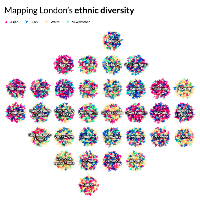
It's a sort of Ben Day dots/Halftone/CMYK mashup on a gridded cartogram and I like the simplicity of the overall effect that shows the broad ethnic mix of each London Borough. Often simple ideas lead to some of the most impactful work, here with the mixing of individual colours leading to an overall sense of predominance in each borough. It's just nice to look at but you can dig into each borough a bit. Interesting choice to put the labels on top so boroughs with long names will obscure more compared to those with short names. What might have been interesting would be colour the label in the predominant colour of the mix of symbols below.
How web-connected is China by Chinapower

Another gridded cartogram of charts. This is an interactive (so go take a look at the original). Interactivity really does push the map to become a canvas for more complex information envisioning. The simplicity of the scaffold belies the amount of information and data points shown. The hover over event brings a specific chart into focus beautifully and instead of offering map or cartogram they've integrated the real geography by positioning the map within the cartogram in the space where Mongolia would be. Great layout decision. As you move across the graphs, the real map reacts to bring focus to the geographical where. And finally, the way in which the colours in the map are carried through to the charts also helps cement the link between real and abstract.
Geological map of Iran by Sean Conway

Draping historic maps over contemporary digital elevation models isn't new but Sean has made this aesthetic his own with the way he uses lighting to create a beautiful three-dimensional image on a flat canvas. I particularly like this example of his work because of the use of lighting to create three-dimensional legends that appear to nest the geological sub-categories. His store includes a great number of these types of maps and they're just pleasing to look at. Unless knowing something about the 1957 vintage of Iranian geology rocks your boat in which case it's doubly good.
Painting by numbers by Elana Schtulberg

Cartographers have often been demeaned as people only interested in colouring in. Yet that's exactly what's going on here and it's terrific. Mashing up some real geographical boundaries and their distinctive shapes with a photograph and extracting colour values with which to 'paint' each area is the simple technique. It renders an interesting outcome evocative of those old school paint-by-numbers painting kits (are they still available?). Lots of different ways to make these depending on your tech of choice and Elana's blog explains her approach. It's a pleasing artistic rendering using familiar map shapes.
How Decades of Racist Housing Policy Left Neighborhoods Sweltering by Brad Plumer and Nadja Popovich

The New York Times have become masters at the art of scrollytelling and this particular story uses maps as a central actor in the story. You have to go to the story to experience how well they delineate the commentary, and explain the historic impact of redlining on contemporary neighbourhoods. The story includes several maps that are cohesive in their overall design but which break down elements of the spatial narrative in different ways and to support different aspects of the story. It's an example of where a collection of maps each does it's own job rather than trying to cram everything on one map and expecting the reader to disentangle the story.
All of us united by the Biden-Harris campaign

Map outlines have often been used as a framework for artistic endeavor. I liked this illustration. The use of colour was emotive and filling the map with diversity leaves a very clear and indelible message.
Manhattan by Alex Bailey

Everything about this map is wonderful. Made by 14 year old Alex in two weeks, it's a 6ft 1:12,000 scale model. The detail, and attention to detail is next level. Lego + maps = AWESOME.
Panoramic map of the Alps by Eric Knight

Clearly this screen grab thumbnail doesn't do justice to this beautiful map (or any of the other examples on Eric's site) but the art of the panorama is not dead. Channeling the likes of Heinrich Berann this is a stunning painted landscape albeit digitally created rather than with pen and paint. Eric still manages to build a very human touch into the work and the labels in particular sit effortlessly in the landscape. There's attention to detail throughout and I particularly like the slight curve of the horizon that immediately tells you you're looking at quite an expanse.
Covid-19: The global crisis - in data by the Financial Times Visual and Data Journalism team.

Another tour de force from the FT team with this scrollytelling piece that uses words simply as the glue holding the wonderful array of maps, graphics, and interactives together. The colour palettes provide excellent contrast, not only leading the eye, but showing clearly what the reader is supposed to get from each map or graphic. There's been many plaudits for the line graphs and other charts John Burn-Murdoch (and others) created in 2020 to plot the spread of the virus and this article incorporates a copious spread of examples. It's also worth noting that the FT, through blogs and social media have been at great lengths to provide explainers to their work to aid understanding. They're not the only ones (FiveThirtyEight did the same with their presidential election web site) but it's a good trend. Expecting readers to comprehend even the most well constructed maps and graphs can always do with extra help in helping people to be able to read them better.
Grave Smoky Mountains National Park by Aaron Koelker

Establishing the right look for a map goes a long way to how people feel when they look at it. This map is ridiculously dark with a very bold muted colour palette but it works because of the subject matter. It's an exploration of cemeteries in the Great Smoky Mountain National Park. It uses an isometric projection to keep scale constant throughout. There's unique and well-designed symbology. There's interest in the detail provided by the written components. It has veils of cloud-cover (whisps of smoke?), a well integrated locator map and excellent use of white space. I could go on. My most favourite component is the neatline which isn't a line. It's composed of text that lists epitaphs from various headstones. Spectacularly creative. A work of cartographic art.
2020 Election map by Randall Munroe (xkcd comic)

Given my predilection for election mapping (did I mention I have a book on this very topic coming out in early 2021?) I could have included any number of brilliant news media efforts that kept us glued to the 2020 presidential election result. A special shout-out to FiveThirtyEight, The New York Times and The Washington Post for their exhaustive coverage. There were geographical maps and cartograms galore to feast upon. Yet Randall's map at once does something very simple. He positions symbols in roughly populated places and gives them a colour. It's a dasymetric dot density map of sorts and it does a great job of negating all that empty unpopulated space from the more commonly seen red/blue result by state map. As you'd expect, in a contest where 51.3% voted for Joe Biden, and 46.9% for the other guy, the map looks very even. It's a more human map because it puts every vote on the map rather than just shouting about who won each state through a large block of colour.
Carrot production in France by Romain Lacroix

A map with proportional, extruded carrots atop a knitted base. Struggles with occlusion and scale front to back as any 3D perspective map does but...carrots. Romain made this map for day 12 of Topi Tjukanov's #30daymapchallenge during November on Twitter. Day 12 was to make a map not using GIS software. There was no better map that day, or pretty much any day.
Commuting in corona times by Kera Till

There were plenty of coronavirus takes on the tube map this year. This one by artist Kera Till was one of the first in March. I generally wince at the various uses of the tube map as a way of representing something other than the tube itself but this gets a pass. It pretty much sums up life in 2020, and I for one can't wait to get back on the real tube some time soon.
Naismith International Park by Kirk Goldsberry

And squeaking in at the end of 2020 is this playful map of the 2019-2020 basketball season in the US. It's all for the love of the sport as elevation encodes scoring positions - higher ground is an area where more points were scored from. And Kirk then went to town building the map into a US National Park Service map with all the iconic symbology, colours, typography and layout you'd expect. It's not just an excellent homage to NPS maps, all of the features relate to stars of the game itself. Even as someone who has virtually zero understanding of the sport I really appreciate the dedication to cramming so much of the sport onto the map. A proper map mashup!
And that's just some of my favourites. I likely missed a load I had at one time intended to be included but not to worry, there's been more important things to focus on this year. And with that, I'll leave you with just one more map which wins the 2020 Gromit award for poor cartography. There were a few contenders this year such as the CNN live election map, or some really rather horrid coronavirus maps, all the usual rainbow coloured maps, non-normalised choropleths, splodgy heat maps and so on. But this just hurts the brain.
Property map by anon.

With best wishes for the holidays and a far better 2021. Hopefully the 2021 roundup won't feature so many coronavirus maps.
Ken