

The subject has been written about extensively. Perhaps the classic text remains Professor Mark Monmonier's "How to Lie with Maps" which explains how geography and the themes we map can be modified and manipulated in various ways, sometimes innocently, sometimes for persuasion or propaganda. Professor Jerry Brotton's film on the subject is also well worth a watch.
Donald J. Trump, 45th President of the United States, has become a master of the use of the map to assert his agenda. In his early days in office he presented a map of the results of the 2016 Presidential election to Reuters journalists and exclaimed "Here, you can take that, that's the final map of the numbers. It's pretty good, right? The red is obviously us."

Despite the map garnering considerable discontent, he wasn't wrong. If I had just been elected Republican President I would likely have used exactly the same map to illustrate the vast swathes of the country that I'd just won; that I'd turned red, perhaps against the odds.
The same map was seen enlarged, framed and put up on the wall of The White House soon after. Of course you would. You'd want to wander round your home and office and bathe in the glory of your victory, and to pause with visitors to note how red the country was. And reporter Trey Yingst caught the moment.
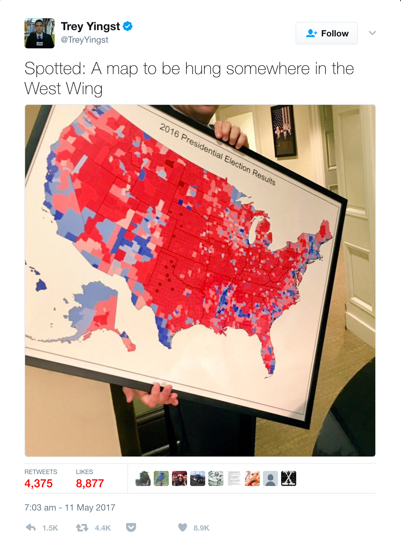
There are many other ways to map the results of that (and any other) election. I've made a gallery of them and the point here is simply to note that what Trump did wasn't wrong, but, rather, he selected a representation of his victory that used geography, data and cartographic techniques to create a map that suited him; that asserted his power, position and dominance.
Remember, the margin of victory in the 2016 Presidential election was slim (and Clinton won the popular vote) but imagine if the result had tipped slightly in Clinton's favour? Would this be the map she'd hang on the wall? Almost certainly not. Clinton would have used the same data which would have shown her with a marginal victory, but the map would have looked very different. More blue. And she wouldn't have been wrong either.
Towards the end of August 2019, Trump was also embroiled in another map mystery coined #sharpiegate. An official NOAA map of the possible path of Hurricane Dorian had been manually modified by the addition of a line, drawn by a felt-tip Sharpie pen, so the cone of uncertainty extended beyond the official extent so it incorporated part of Alabama.

It's suggested that this was to support a previous statement by Trump that "Alabama looks like it's going to get a big piece of [the hurricane]". The resulting furor centred on the modification of an official document, the falsifying of statements relating to the forecast, the sharing of misinformation and the way in which someone (allegedly Trump himself) had changed the map to suit a different narrative. This is a more serious case of map misuse. It undermined the official body responsible for producing the maps. It had the potential to be scaremongering and dangerous to people and property who were not in any way going to be affected. Trump denied all knowledge of how the extra mark was put on the map but it's a small leap between hand-drawn modification and more sinister manipulation of official maps that are received as trusted mechanisms of the truth.
Fast forward to late September 2019 and Lara Trump (daughter-in-law to Donald) tweeted another map as a response to the announcement that Trump was to face impeachment proceedings. Trump himself retweeted it on 1st October.
Once again, a map, bathed in red is used as a way to reinforce the message that Trump's support covers literally every part of the country. Once again, the map itself is not wrong (well, it is, a bit, but we'll come to that). It is exactly the map you'd use to frame your argument that you represent the country when you're threatened and are in reactionary mode.— Donald J. Trump (@realDonaldTrump) October 1, 2019
But this binary red/blue county level map obfuscates perhaps a more truthful version. Yes, the counties that are red were won by Trump but the map pays no attention to population distribution, population density or, indeed, the electoral college voting system. It's an artifact of the cartographic technique, the many decisions over time that have determined where boundaries are drawn, and not where people voted and in what amounts. The addition of the statement "Try to impeach this" is a challenge as well as a threat, and its juxtaposition with the map frames the argument as "us vs them". The use of the map to create a strong connection between Trump and what he perceives as his all-encompassing support in the face of what he sees as Democrat and media fuelled fake news is made. The map is published and consumed. It breeds division as some will find it speaks to their truth, and others will be appalled since it pays no attention to their truth.
As an aside there was some debate about whether the map was, in fact, the 2016 result. Some thought it bore more of a resemblance to Bush's 2004 victory. Put simply, some counties are red that were not red in 2016. The map appears to have been modified to appear more red than it really was. On closer inspection it seems that some counties that were won by Clinton, but with less than a 50% majority (because of third candidates in the main) have been shown in red.
There's some irony in the map too. San Bernardino county is the largest in the US. It's down in the bottom left corner in California. It's blue. Yes, at a county level Clinton won it but 95% of this county is unpopulated. So there's actually more blue on the map as a function of this county's size and shape than needed to have been on the map if another cartographic technique had been used.
So Trump is a serial map-abuser. These three examples clearly show how he uses the map for dominance and to assert his apparent power and possession. This is Trump's America. He's simply the latest in a very long line of leaders, politicians, dictators and many others to use maps to try and illustrate a version of the truth that has been cartographically mediated to suit a partisan purpose. Like I said, it's not wrong to use maps to tell a certain story (apart from when the facts are clearly manipulated which is stretching truth to the realms of plain lies) but it is a case of "reader, beware".
Those that consume the maps he promotes (us!) have widely varying abilities in seeing beyond the cartographic tricks he's using. Many have little idea or motive to question what they are seeing. This, to me, is the more fundamental problem. The general population have no reason to question the maps that are presented to them. But they should. They absolutely should. I spend much of my professional life exploring how maps can be made to tell different stories and how we can imbue them with shades of the truth in different ways, for good or bad. My second book is going to be on this very topic.
In the meantime, I'd encourage you to challenge yourself to read maps and charts with a more critical eye. And to do this, go read Monmonier's "How to Lie with Maps" and the recently published book by Alberto Cairo called "How Charts Lie". You will become a much smarter consumer of graphical information by learning a little of how you are being manipulated by the maps put in front of you.