Monday 30 December 2019

Favourite maps from 2019

Maps that cross my path must be getting better. Since I started this blog as a way to critique what I perceived as poorly designed maps, the number of blog posts I write annually has decreased. That's not to say that there aren't still some awful maps out there. There are. But maybe the balance is getting better? Or I'm getting less choosy? Or, who knows?

There's clearly still some major issues to address in the world of improving people's diet of maps. Persuading people that Web Mercator really isn't either the best choice, or even an uncontrollable default, still needs more work. So does the incessant use of rainbow colours on many, many maps. Just stop it. Please! If your work suffers from a #cartofail like this then you will not see it in this particular blog post that's firmly focused on the good stuff.

I always say that great work can do much to show people a better way so in that spirit, here's a bunch of maps that I saw in 2019 that I really liked. It's not a top ten. I saw many more I also really liked. There's likely many great maps I never even saw so it cannot be considered complete or comprehensive. They're in no particular order either but it's just a record of what I found good in this year's world of cartography. I'd also encourage you to go to the originals via the links. All I've included here are some screen grabs.

Mapping America's wicked weather and deadly disasters by Tim Meko (Washington Post)

Maps took centre stage in this scrollytelling article, and each was well crafted, vibrant and insightful. They're simple in scope but that doesn't mean simple maps. They're just pared back perfectly to fit web delivery. Great examples of contemporary web cartography. Six maps in total. All working together as a coherent set. Here's one:


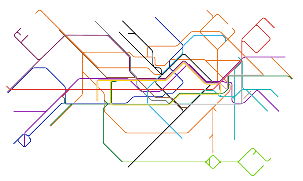
Shinkansen Map by Jug Cerovic


I have a slight fetish for transit maps (as I'm sure most know) but I'm always interested in new takes. Jug's work in redesigning many of the world's major transit systems is phenomenal and worth checking out in its own right. Here, he takes a wonderfully artistic approach to Japan's bullet train network around the rising sun illuminating the north-west of the layout. Genius!


A few years ago I messed around with a technique to symbolize UK election data in a the style of a Jackson Pollock painting (and I recently applied the same technique to the 2019 General Election). But it's wonderful to see ideas take on a whole new life in different contexts and this re-interpretation and application of the technique to showcase tree species and canopies is wonderful. The overall composition including text, graphs, satellite imagery and illustrations creates a perfect modern infographic.


Emoji map of the UK by Ben Flanagan

My friend and colleague Ben wasn't the first to make maps out of emoji but his efforts at making them from 240 characters in Twitter was fun and spawned a whole raft of efforts from many other people. I particularly liked his playful riff on the ongoing discussion of the Shetland Isles and inset maps which came to the fore in 2018 and still manages to be a source of cartographic humour.


Resilience in the Iroise Sea by Le Monde

This is one of 40 maps in the 'The time of the island" exhibition that took place in Marseille, France,  this year, on the Geopolitics of Islands. It's just exquisite. Almost an historic, retro aesthetic but the layout, the linework, the colours, the typography - all perfectly harmonious. I particularly like how the north arrow and scale bar are incorporated into the map's frame.


Income distribution in Switzerland by Angelo Zehr in SRF News

Bivariate choropleth maps are hard. You have to limit the number of classes to an absolute minimum, maintain a sensible classification, and still allow the reader to see the relationship between two variables. This map does that job perfectly (also on the interactive version). But what I really like about this map is there's no spurious shading where there are mountains and no people. All too often we overlay arbitrary enumeration areas across geographies that exhaust space but fail miserably to show the differences between where people are and where they are not. I love that this map made the effort, and also still managed to add interest with a hillshade. It's Switzerland after all.


Trump Meltdown by Michael de Adder

Cartoons and maps have always gone well together and in the expert hands of political cartoonists they really take centre stage. I love this cartoon that shows Trump clinging on for dear hope to Florida as he drags the USA to even murkier depths. The bemused fish perhaps represents what everyone else is thinking as they sit back and watch the current political situation unfold.


Heating of the Arctic by Greg Fiske

November 2019 saw a fantastic twitter #30DayMapChallenge which had contributions from many and is well worth a trawl. The concept was simple, for the theme of the day, create a map of some data. The time limit was almost self-imposed so the maps were often quick and dirty, but that didn't mean they lacked beauty and great design. Maps by Jo Wood and Craig Taylor, in particular caught the eye. But the single most interesting map I saw was this. It's a view of the data I'd not seen before and that always makes you stop and pause. This may have been made quickly but it's clean, arresting and informative.


The Man Behind the Maps by James Niehues

Not a map, but a collection of maps representing the career of legendary ski resort artist James Niehues. If you've ever been skiing or snowboarding then you've likely used a trail/piste map illustrated by James as he embodies the latest of a small line of talented panoramists (Heinrich Berran, Hal Shelton, Bill Brown). This book came about through a kickstarter project that went viral. Now, instead of tattered, soggy maps you have to throw away after a few days on the slopes, they are beautifully collected in this magnificent book with all sorts of background notes. A true feast for the eyes of anyone who loves mountain cartography.


Fimbulheimen in Dronning Maud Land, Antarctica by Anders Skoglund (Norwegian Polar Institute)

This map came away with the big awards at the 2019 International Cartographic Conference in Tokyo and rightly so. It won on so many levels. It was huge. At 1:250,000 but measuring over 2.5m long and a  metre tall it was stunning to see such a large high resolution satellite map of this part of Antarctica. Was the size just for capturing attention? No. The size of the map juxtaposes the sparse, barren, yet stunning landscape punctuated with small crops of intense detail. The map is littered with skillfully placed and detailed typography. If you've got a wall big enough you can download it yourself from the link above because clearly this blog cannot do it justice.


This map won a shed load of awards in 2019. Of course it did. It's made of gold leaf and is a stunning (c)art(e) piece. If you're after an award then this is the approach to take. Make something visually stunning that people naturally want to pore over in a gallery. Can you use it as a map? Unlikely. Want it on your wall? Sure!


Where the wild things glow by Jonni Walker

I give my good friend John Nelson a lot of ribbing for his firefly symbol creation. Truth is I love it, but as with any symbol scheme it often gets mis-used (i.e. applied to any dataset for the hell of it regardless of whether it's actually suitable or not). So to see the approach used on a map of bioluminescence was perfect. But this map goes well beyond just a good match of symbol to subject. The overall atmosphere is engaging. The layout is full of detail yet not overcrowded. There's description to aid the reader's interpretation and best of all, the tilt of Australia to make the map work within the page size and shape, and to provide space for the other marginalia is the best trick.


An Atlas of Space by Eleanor Lutz

There was a time back in 2016 when Eleanor gave us simply a beautiful portion of Mars but this year she released  a collection of ten maps of planets, moons and outer space. It's a wonderful collection of different design approaches and new expressions of cartographic creativity. Colourful landscapes of natural and human impacted phenomena which are all made programetrically too. And this work is her part-time gig. She's studying for a Biology PhD in disease vectors of mosquitos.


Wasabi Pea map by Anton Thomas

OK, so, drink was involved. At the NACIS 2019 conference what better way to divest of a bowl of inedible wasabi pea bar snacks than make a map out of them? Trouble is, in a bar full of cartographers there's only really one person who can carry out the task of making a world map without downloading some map data and churning it through some software. Anton Thomas got to work, captivating the bar and, from memory made this perfect little world map. The best bit - not Mercator (though to be fair it's hard to determine its exact properties). And then it was gone...


The end of the world by Eloise Field (age 10½)

Children's maps are a whole magnificent cartographic sandpit in their own right. The Petchenik Children's map competition at the 2019 International Cartographic Conference in Tokyo showcased some incredible work (plus the usual eye-brow lifting entries that might have had some, ahem, adult help). You can see the winning entries here. But favourite children's map for me this year wasn't part of the exhibition at all. It was drawn by my niece, Eloise as part of her school work. The task was to create a drawing that represented 'the end of the world'. The cartographic force is strong in this youngling.


Sharpiegate map by Kenneth Field, Anthony Robinson et al.

And finally, I don't normally put my own stuff in these lists (that's for others to judge according to their own tastes) but the world is in a weird place and with the apparent Presidential modification of an official NOAA map of Hurricane Dorian I felt this worthy of inclusion. Anthony Robinson and I concocted a bit of fun in the wake of what became known as #sharpiegate. We made some sharpie "official cartography pens" and I took a blank map to the 2019 NACIS meeting in Tacoma WA. Simple idea - leave the map in public for a few days and see what happens. It's cartographic performance art. Most maps show a point or period in time. This map is of its time. It's a collection of dozens, if not hundreds, of people's comments, drawings, additions, modifications and so on. There's some very famous cartographic hands across this work. It was fun.


Agree? Disagree? I liked them all for many different reasons.

Happy Mappy New Year to you all.


Tuesday 1 October 2019

Trump's maps of dominance

Maps have been used for centuries as tools of power, plunder and possession, to control narratives and sway opinion. Historical atlases have frequently included a frontispiece that illustrated people touching the globe as a statement of their power, authority, and ownership.

Image result for mercator atlas frontispiece

The subject has been written about extensively. Perhaps the classic text remains Professor Mark Monmonier's "How to Lie with Maps" which explains how geography and the themes we map can be modified and manipulated in various ways, sometimes innocently, sometimes for persuasion or propaganda. Professor Jerry Brotton's film on the subject is also well worth a watch.

Donald J. Trump, 45th President of the United States, has become a master of the use of the map to assert his agenda. In his early days in office he presented a map of the results of the 2016 Presidential election to Reuters journalists and exclaimed "Here, you can take that, that's the final map of the numbers. It's pretty good, right? The red is obviously us."

Image result for "Here, you can take that, that's the final map of the numbers. It's pretty good, right? The red is obviously us."

Despite the map garnering considerable discontent, he wasn't wrong. If I had just been elected Republican President I would likely have used exactly the same map to illustrate the vast swathes of the country that I'd just won; that I'd turned red, perhaps against the odds.

The same map was seen enlarged, framed and put up on the wall of The White House soon after. Of course you would. You'd want to wander round your home and office and bathe in the glory of your victory, and to pause with visitors to note how red the country was. And reporter Trey Yingst caught the moment.

Image result for "Here, you can take that, that's the final map of the numbers. It's pretty good, right? The red is obviously us."

There are many other ways to map the results of that (and any other) election. I've made a gallery of them and the point here is simply to note that what Trump did wasn't wrong, but, rather, he selected a representation of his victory that used geography, data and cartographic techniques to create a map that suited him; that asserted his power, position and dominance.

Remember, the margin of victory in the 2016 Presidential election was slim (and Clinton won the popular vote) but imagine if the result had tipped slightly in Clinton's favour? Would this be the map she'd hang on the wall? Almost  certainly not. Clinton would have used the same data which would have shown her with a marginal victory, but the map would have looked very different. More blue. And she wouldn't have been wrong either.

Towards the end of August 2019, Trump was also embroiled in another map mystery coined #sharpiegate. An official NOAA map of the possible path of Hurricane Dorian had been manually modified by the addition of a line, drawn by a felt-tip Sharpie pen, so the cone of uncertainty extended beyond the official extent so it incorporated part of Alabama.

Image result for sharpiegate

It's suggested that this was to support a previous statement by Trump that "Alabama looks like it's going to get a big piece of [the hurricane]". The resulting furor centred on the modification of an official document, the falsifying of statements relating to the forecast, the sharing of misinformation and the way in which someone (allegedly Trump himself) had changed the map to suit a different narrative. This is a more serious case of map misuse. It undermined the official body responsible for producing the maps. It had the potential to be scaremongering and dangerous to people and property who were not in any way going to be affected. Trump denied all knowledge of how the extra mark was put on the map but it's a small leap between hand-drawn modification and more sinister manipulation of official maps that are received as trusted mechanisms of the truth.

Fast forward to late September 2019 and Lara Trump (daughter-in-law to Donald) tweeted another map as a response to the announcement that Trump was to face impeachment proceedings. Trump himself retweeted it on 1st October.
Once again, a map, bathed in red is used as a way to reinforce the message that Trump's support covers literally every part of the country. Once again, the map itself is not wrong (well, it is, a bit, but we'll come to that). It is exactly the map you'd use to frame your argument that you represent the country when you're threatened and are in reactionary mode.

But this binary red/blue county level map obfuscates perhaps a more truthful version. Yes, the counties that are red were won by Trump but the map pays no attention to population distribution, population density or, indeed, the electoral college voting system. It's an artifact of the cartographic technique, the many decisions over time that have determined where boundaries are drawn, and not where people voted and in what amounts. The addition of the statement "Try to impeach this" is a challenge as well as a threat, and its juxtaposition with the map frames the argument as "us vs them". The use of the map to create a strong connection between Trump and what he perceives as his all-encompassing support in the face of what he sees as Democrat and media fuelled fake news is made. The map is published and consumed. It breeds division as some will find it speaks to their truth, and others will be appalled since it pays no attention to their truth.

As an aside there was some debate about whether the map was, in fact, the 2016 result. Some thought it bore more of a resemblance to Bush's 2004 victory. Put simply, some counties are red that were not red in 2016. The map appears to have been modified to appear more red than it really was. On closer inspection it seems that some counties that were won by Clinton, but with less than a 50% majority (because of third candidates in the main) have been shown in red.

There's some irony in the map too. San Bernardino county is the largest in the US. It's down in the bottom left corner in California. It's blue. Yes, at a county level Clinton won it but 95% of this county is unpopulated. So there's actually more blue on the map as a function of this county's size and shape than needed to have been on the map if another cartographic technique had been used.

So Trump is a serial map-abuser. These three examples clearly show how he uses the map for dominance and to assert his apparent power and possession. This is Trump's America. He's simply the latest in a very long line of leaders, politicians, dictators and many others to use maps to try and illustrate a version of the truth that has been cartographically mediated to suit a partisan purpose. Like I said, it's not wrong to use maps to tell a certain story (apart from when the facts are clearly manipulated which is stretching truth to the realms of plain lies) but it is a case of "reader, beware".

Those that consume the maps he promotes (us!)  have widely varying abilities in seeing beyond the cartographic tricks he's using. Many have little idea or motive to question what they are seeing. This, to me, is the more fundamental problem. The general population have no reason to question the maps that are presented to them. But they should. They absolutely should. I spend much of my professional life exploring how maps can be made to tell different stories and how we can imbue them with shades of the truth in different ways, for good or bad. My second book is going to be on this very topic.

In the meantime, I'd encourage you to challenge yourself to read maps and charts with a more critical eye. And to do this, go read Monmonier's "How to Lie with Maps" and the recently published book by Alberto Cairo called "How Charts Lie". You will become a much smarter consumer of graphical information by learning a little of how you are being manipulated by the maps put in front of you.

Tuesday 30 April 2019

Revisiting another new map

I don't think it's possible to make a map in isolation of critique. You have to get eyes on your map and listen to people's comments, concerns and (if you're lucky) congratulations. And of course, the closer you are to a deadline the more pressured the situation, and the less likely you are to be able to give people time or to make changes based on feedback.

And so it was when I hurridly finished up my re-imagined version of the London Underground map a few weeks ago. You can read about my original map and a how-to that explains the technical side of its construction. The map needed to be finished and printed in time for me to take it to the Schematic Mapping Conference in Vienna. I was up against it because I was due in Washington D.C. the week before and our production facility also (quite reasonably) needs an amount of time to print it. So I ended up rushing it and didn't have enough time to get enough eyes on it before it would be publicly shared.

I sent it to Cameron Booth who runs the wonderful Transit Maps blog and he provided some extremely helpful comments. Colleagues at work also briefly looked at the map once printed. 'Text is too small' we all cried. Me included. Too late to do anything about it. I went to Vienna where no-one really bothered looking at the map or offered comment. But I've gone back to the map and made changes I believe make it better. So here's the updated map (you can grab a full-sized hi-res version here):


There's larger lettering throughout. The smallest text is now 3pt larger than before. It's more visible and legible. Clarity is improved. I've also introduced text with different treatments to marry to the station functions. Interchange stations have larger text. Stations that connect to National Rail services are both larger and a different colour to match the updated station symbol colour. I've printed it at the same size as the current official London Underground pocket map (22cm wide) and the legibility holds up.

I've avoided the use of a separate symbol to show connections to National Rail services altogether. Originally I wanted to avoid the old British Rail symbol (arguing that international visitors wouldn't have a clue what it was anyway). But despite trying multiple different icons to sit beside the station names it never really worked. Simply encoding the station's different function into the size and colour of the typography and changing the colour of the station symbol itself allows me to do away with the additional symbol altogether.

There's more consistency in terminus symbols where one line folds into another. I just hadn't done a good job in what is quite a unique approach. I'd missed some. These are now corrected.

The previous design was a 'lines first' approach and whilst this second version is by no means a 'labels first' approach there's been quite a lot of moving and reorganising of linework to give better balance and create additional space for the larger labels. I don't think the result deviates too much from my original intent. In fact there's better spacing across the map whereas previously there were a few fairly congested areas.

The Elizabeth Line westward extension stations to Reading now appear in a box rather than on the line itself. I wrestled with this. They can fit into the line but Reading is nowhere near London and it's a fair point to suggest it shouldn't be included on a map that portrays it no further west than Uxbridge or Heathrow Airport. This is a nod to Harry Beck's original designs that used a similar style for edge cases.

I clarified the Barbican/Farringdon/Elizabeth Line interchanges. previously there were two separate Elizabeth Line stations connected to Farringdon and Barbican but this isn't how they operate in situ. Rather, Farringdon and Barbican both link to a new intermediate connected station on the Elizabeth Line.

I repositioned South Tottenham station below Seven Sisters so that those walking between them would be able to at least understand which is north of the other.

Many of the outer extremities of lines and stations have been repositioned and spaced to try and improve the overall appearance.

The station labels have all been tweaked to improve the consistency of their placement with respect to distances between lines and offsets from station symbols.

So, there you go. This is version 2 of the map. I'm quite pleased with it. I've been able to spend more time with it and appreciate the limitations of the first version. I've taken on board comments and made changes where necessary. I still think I've been able to retain what I like about the official map (colours and typeface) that relates it to the 'London look' but it's develops a new graphical language for pretty much everything else. Version 2 is a better map than version 1 because it's had eyes on it.

As with the first version, I invite people to rip version 2 to shreds and offer comments.Thanks.

PS - And yeah, there's now an Easter Egg on the map. Should have added it first time round but ran out of time and forgot.

Tuesday 16 April 2019

Academic parochialism

Last week I went to a schematic mapping workshop in Vienna, Austria. Schematic maps are some of my favourites and I'd used this opportunity to finally get round to developing my own ideas about a redesign of the London Tube Map. I'm by no means the first and won't be the last but after penning a discussion of what I characterised as the over-use, mis-use and abuse of Beck's original style from 1933 (The Cartographic Journal, 51, 4 pp343-359) it really was about time I put my money where my mouth was and had a go. The workshop provided a hard deadline and an impetus to make a map and throw it to the lions.

Me. And my map.
There were about 40 or so people attend the workshop. People came from a wide array of academic backgrounds - psychologists, computer scientists, graphic designers, cartographers and the transport industry itself. I'll be blunt. It was disappointing. While there were some interesting talks there was very little true sharing of ideas or development of collaborative opportunities. The cliques stayed within their own cliques and so the opportunity was lost. I displayed my maps and not one person wanted to actively engage in a discussion, or offer ideas for improvements. Having paid for the trip out of my own pocket that's disappointing. So what we ended up with was another example of academic parochialism at its worst. Niche groups striving headlong up their own small part of a much wider discourse and not really willing to engage beyond what they know or do. There were lots of words but not much else.

We had people focusing on usability, but not really appreciating practical implementation. We had people searching for efficient algorithms for label placement or line arrangement, not appreciating that many software packages already exist to do much of that heavy lifting. We had the idea that a fully automated map is difficult to create but never a real discussion about why you'd want that anyway. After all, maps are always made by humans to a greater or lesser extent. We had the idea that many who make schematic maps do so with design software. There was little from the GIS or data-driven cartographic community and no real appreciation of its existence or value. A lot of it was searching for a solution to a problem that isn't properly defined. It's low-level academic effort. The sort that keeps people busy but doesn't ever actually get anywhere purposeful. I know. I used to live in that world, and the further I get from it the more I recognise it for what it is and the more I am relieved to be out of it.

And the classic examples of 'research results' based on a survey of a group of students who are easy to cajole into research always has me raising my eyebrows. At best it's lazy, at worst, it undermines your work beyond it being useful. Of course students are likely to also be public transport users but they are not a diverse enough set of people if you want to capture the wide variety of people who have many and varied needs. I think we can do better. But there was also something else that made me think about the event in a way that I cannot ever recall feeling before.

I guess what I found most disconcerting is I felt like an outsider. This is a group founded and moulded by Maxwell Roberts who describes himself as "the world’s leading specialist in schematic map design". So, inevitably, there's going to be some disciples of his work in attendance and, as it turns out, all but 4 talks were 'invited'. Dr Roberts even took the floor twice for two 35 minute stints to bookend the event. Except I'm not one of his disciples. I like much of his work but ever since I wrote that journal article, Dr Roberts has made it known he took exception to my characterisation of some of his work as being unhelpful to wider debates about the value of Beck's work. To me, there's value in debate. Just because person A says something, person B does not have to agree. I used the opportunity to write a refereed paper that expressed my views based on the evidence I presented. In normal academic discourse, such views can and should be challenged. Different views expressed and published and so forth. But, it seems, this is not the case and it was unfortunate that Dr Roberts went out of his way to avoid me in Vienna. It's unfortunate but I can live with that. Should I have approached him? Possibly. But when you get bad vibes you tend not to bother in the interests of self-preservation.

Map Gallery at the Vienna Transport Museum.


There was a gallery of work on display at the Vienna transport museum on one evening. My maps were up there and earlier in the day I'd expressed my wish that people tackle them, rip them apart and let me know what they thought. I even wore my London Underground District Line Moquette shoes for some added interest. Maybe Dr Roberts would take the opportunity? Unfortunately not. Again, he went out of his way to avoid me (and my colleague Professor William Cartwright too).

Professor William Cartright and I at the map gallery.


I was going to leave it. If that's how these people want to work and (not) foster collaborative opportunities or, even, have a good old-fashioned academic slanging match then that's up to them. I returned from Vienna glad to have reconnected with some good friends, met a few new people and, once again, to have visited such a beautiful city. Except this morning I woke, to this tweet by @TubeMapCentral (aka Maxwell Roberts)


So let's get this straight. Dr Roberts had every opportunity to talk to me last week. He had every opportunity to discuss my previous paper as well as my effort at making a map of the London Underground. But no. Instead, he posts a bitchy tweet (without using my twitter handle). It's a shame he didn't say my font was too small to me in Vienna because I totally agree with him. In fact, the prints were the first time I'd seen the work printed and my first reaction was the same - fonts are way too small. WAY too small. And this is the point of critique - to put your work in the gaze of your peers and others and to take on board comments and criticisms. A future iteration will address this limitation.

I wasn't going to write about my experience in Vienna but his tweet has me annoyed simply because he could have spoken to me in person. I should have seen the signs. Last talk on day one. My colleague, Professor Cartwright given less time than the other speakers. It all added up to support the fact that we simply were not wanted at the workshop because 5 years ago we had the audacity, the sheer temerity to offer some critical thoughts on some of his work as part of a wider debate. Yet they took our registration fee quite happily to boost numbers. If you're going to marginalise people then do so with class. But it doesn't achieve much. It narrows your potential for considered debate, albeit some of which might be challenging, but which ultimately strengthens a discipline. I don't like some of his work so therefore he doesn't like me. Makes sense eh? Not to me it doesn't. Tweets are cheap. I know, I send enough of them! But having had the opportunity to tackle me about the 2014 paper, or even chide me for my amateurish effort at tackling a really tricky map he, instead, waited until there was no danger of discussion. Ahh well.

What I did find of immense value at the workshop was listening to a presentation by the train manufacturer Siemens along with those at Wiener Linien who are exploring their cartography in relation to real needs, namely to fashion maps for a new generation of trains. So they are getting on with the job. We weren't allowed to take photos and I should probably not say too much as the work is currently not public and remains confidential. Except to say, they are experimenting with some really innovative animated maps. These go well beyond having a simple animated symbol that shows where you are on the route. There's morphing of the map under particular circumstances, changes to content depending on location and conditions, focusing of detail to serve the needs along the route, and real-time information delivery that goes way beyond simply showing train times and connections. I've honestly not seen anything like it and had a wonderful chat with the people behind it. These are the conversations you enjoy and ones which take you forward. The small-mindedness of a few has not detracted from my experience of this particular work and the potential it offers.

This, to me, also shows where we are in terms of who is driving research these days. Industry has overtaken academia in many fields. Cartography is one such field. Small groups of people doing very niche academic research into aspects of map design are becoming unimportant. And I think that's why these sort of workshops become increasingly frustrating. They aren't really helping move things forward, certainly not with much pace. There's too much reinvention and no real cohesion. They seem to exist to further one or two people's aspirations for relevance, rather than a sustained research agenda that feeds into real implementation. And along comes a train operator who, along with their customers, defines a need, researches it, and develops a solution.

I expressed this view earlier in the day at an 'open mic' slot where I used 10 minutes to play devil's advocate. In 2005 Google both decimated and utterly reinvented cartography. Since then, most transport networks persist with their schematic maps yet I contend that people are more interested in travelling between places of interest, not station names. Of course, this goes against Harry Beck's principles that above-ground geography is unimportant to the traveller but I think times have changed. So, for instance, if I'm in London and I want to travel between the London Eye and Selfridges how do I work out my route? I open Google Maps and I type in directions. I would suggest most people will likely do the same. In fact, I cannot recall the last time I actually saw someone use a pocket London Underground map. And even if I did I have to know where the two points of interest are in the first place and relate them to the location of stations. That's often very difficult with a schematic map. And yet Google Maps returns the optimal route (walk to Westminster station and catch the Jubilee line to Bond street). It gives me real-time train arrivals, journey time, walking routes to bookend the tube journey, as well as bus alternatives, and it now even tells me that a Lime scooter is nearby and could be quicker. The map zooms to become hyper-local. We see the actual location of station entrances so we can relate our geographical surroundings to where we actually need to go. And the map has the geographical tube network overprinted. So, my assertion is that, in 2019 the schematic map as we know it and love it may be dead. People use their smartphones and Google Maps to do their journey planning. It may well be the case that the printed schematic map has been killed by Google. Maybe this is what upset Dr Roberts? I don't know. I don't particularly care.

Unfortunately, in retrospect, the workshop was simply about his self-promoting academic parochialism. I'm glad I'm out of it, and Max, if you're reading this, please be assured I'll not darken your door at the next workshop. But I will be buying your next book on airline schematic maps because I'll likely very much enjoy it.

Professor Georg Gartner and Dr David Fairbairn discuss the Vienna map.
Update:
Unfortunately, Dr Roberts has decided to double down on his twitter rant.

Seems a little unfounded to me but I made the point that the opportunity to discuss, debate, argue even, was last week. Why didn't he take the opportunity to have me on a panel discussion for instance? Or even have a quiet word with me during one of the breakout sessions? It's not unusual for people who are passionate and knowledgeable about a subject to sometimes disagree but the art of academic discourse is to attempt to appreciate other people's perspectives. If you are closed to that, and wrap it in unsubstantiated personal attacks then you are doing yourself a disservice. I am concerned for his students if this is how he fosters discussion and engages in debate. It also reflects poorly on the University of Essex if this sort of approach to academic discourse is in any way supported.

Monday 8 April 2019

Another new design for an old map

As many of you will know, I have a long-held fascination with the London Underground map and schematic maps in general. And for at least the last decade I have written and presented extensively on an assertion that while Beck’s ideas (though not necessarily new in and of themselves) have become the model for many transit networks, the Beck map also suffers from misuse, abuse and parody. I’ve even gone to the effort to catalog this collection as an interactive tube map of tube maps using a tube map which currently has over 300 entries (stations).


In 2014 I wrote a paper with Professor William Cartwright that was published in The Cartographic Journal entitled 'Becksploitation: The Over-Use of a Cartographic Icon' (preprint here) We played devil’s advocate as an attempt to provoke and promote debate about the legacy and ongoing use of the Beck model for transit mapping. And in conclusion, we summed up our critique by calling for a fresh start, a reset of the London map to overcome many of the problems that the current map faces as it simply tries to update Beck’s ideas:

“We’d like to encourage a return to thought, experimentation, drawing and testing as a way of discovery and the search for the next great map style. Beck made a cartographic icon for one purpose – to navigate the London Underground; a perfect map made at a perfect place and time. We need new, fresh and challenging maps.” (Field and Cartwright, 2014 p358)

And that problem begins with the current London Underground map which has become a model of how not to iterate a map which had its day nearly 90 years ago. The original map is a piece of perfect cartographic design and undeniably useful for navigation and wayfinding. It’s debatable whether the current version is useful any more. Beck's brilliance was to omit above ground detail, creating a schematicised map with huge distortions in scale and real-world location. The colours were coded to fit the wider corporate design aesthetic and he used straight lines for curved railways – horizontal, vertical, 45° which were also indicative of speed and efficiency of the network. A practical outcome as much as a brilliant design statement.


And this is the current map (link to TfL maps) showing the massively increased network of interlinked services but which still retains the same basic principles that Beck brought to the map.


In my view (and that of many others) it’s lost its way. It’s full of clutter. There’s still elements that need to be retained – the typeface and colours are intrinsic to the look and feel of the London map in my opinion. But the lines are disorganized. The amount of detail overbearing. The station tick marks might be due for retirement and the interchange symbols might be modified. Representing accessibility has become a preoccupation for Transport for London but it may be better off the map, in a list of stations. And what of the British Rail symbol? – is this really so useful for foreign tourists for instance? Can that be redesigned? Do we have to show intermittent services on the map? After all, there’s a separate map for night services now and there's no sign of those services on the main map. Some interchanges have become terribly congested.

In summary – it was about time I put my money where my mouth was and had a go at a redesign rather than just moaning at the map and what it has become, not to mention some of the redesigns I've not warmed to particularly. And it's worth noting at this stage I'm not the first and I won't be the last.

The idea was simple, start from scratch, and if you're making a schematic, it's a diagrammatic approach and you need a grid to start with to give the map order. A grid that tessellates such as squares, triangles or hexagons. I’ve experimented before and was almost settled on a hexagonal grid but there was just something aesthetically that I didn’t particularly like. Too messy.

So I settled back on using squares because it just seems to fit London quite well. And because I wanted to begin by physically ‘sketching’ I built a peg board. A piece of board with 800 nails at 3cm intervals to create my scaffolding.


And I bought some thread and began to make my tube map from scratch. The beauty of this was that the physical process meant I could rapidly re-route as I encountered issues and difficulties, but I was trying to be a little more geographical so, for instance, the Northern Line actually doesn’t go vertically north as it does on the official map, and many others. So I began with that as an anchor, but it moves more north-westerly. And the Central line remains quite well served by remaining broadly horizontal. One of the key differences I wanted to establish was a better relationship between the above and below ground. Yes, this would be a schematic, but I wondered if I could keep the key physical feature, the River Thames geographical. I was also trying to build a map that could support an experimental 3D version where I could fit above ground detail into the intervening spaces.

And this is what I ended up with, about 30hrs later.
As I was building the map I became aware of something interesting that began to excite me – there’s diamonds everywhere. And, of course, Beck’s initial map used diamonds as interchange symbols, and the Johnston typeface is renowned for the diamonds atop the lowercase I. So I liked the nod to his legacy even though I was trying to make something new.

I won’t bore you with the process of generating the digital version but I effectively brought digital photograph of the peg board into ArcGIS Pro, georeferenced it, then build a digital peg board and traced my map. I wrote a blog about that whole process as part of my day job if you're interested in how to make this yourself.


Of course, dealing with digital thread that used the same nails as vertices was the next challenge so there was plenty of offsetting lines. But I ended up with this basic layout:

There’s significantly fewer changes of line direction compared to the official map. There’s a similar density of linework but I feel the strong central diamond of the Northern Line within which others nest in and around brings the eye back to the core area of the map. In my opinion it’s a cleaner network. Less spaghetti. Crisper perhaps? Yes it’s still intrinsically diagrammatic but perhaps better balanced. The central area is a little more rectangular in overall appearance.

Let’s take a closer look at some of the design decisions. I retained the horizontal, vertical and 45° lines; TfL colours. Johnston typeface, but now in a more muted 70% black. These are all decisions that give the map 'the London look'. I omitted river services, accessibility detail, limited services, and fare zones which to my mind are simply clutter. They just do not need to be on THIS map and can be better presented in other companion products. At some point you have to make the decision about what MUST go on the map. Omission is the most under-used cartographic tenet yet it is vital to deliver clarity in a final product.


I changed the line symbols which are now cased which helps with establishing separation between adjacent lines and for where lines cross. The British Rail symbol replaced by a different national rail interchange symbol. Station symbols are replaced by white (negative) space and within the line to leave more space for labels and other content. Interchange symbols follow the same basic structure but with an internal 70% black symbol. Interconnectedness is implied by adjacent symbols ‘touching’.

Walking symbols replace the pecked lines on the official map which I think are more intuitive. I also simplified many of the junctions with fewer overlaid symbols, for instance here at Earl’s Court. I also used line folds into a single symbol at terminal junctions. In some respects this new map respects geography a little better. The wayward northerly direction of the western edge of the Central Line has always bothered me. Yes, it veers north a little but I managed to straighten it out and return it back to the horizontal line on Beck’s original 1933 map.


I would also argue that my mainline London station connections are far more streamlined than the official map’s counterparts (comparison for Paddington below).


Though early critique of my use of a different way to represent national rail connections proves how iconic embedded symbols can be in our minds eye. I was trying to avoid the old British Rail symbol but I may end up going back to it, or something else. Simple connectors are used for complex interchange stations like Bank/Monument.


I think this comparison, perhaps more than any shows that I think the time has come to dispense with large, bulky, black cased interchange symbols. We can make a more elegant map. And I managed to get a geographical River Thames into the design which I believe gives the map a sense of realism rather than the stark schematic. It’s tapered – like Beck’s original and a feature that has also been lost in the mists of time. I carried the diamond motifs to the four corners of the map which helped tidy up bits of line going off in all directions – a bit contrived in places but, well, why not. After all, it is a 'diagrammatic map' And here's the final (first iteration) of my effort:


You can download a copy of the map here as an A2 poster. It’s designed for paper because…paper.

The basic form of the new map takes a traditional planimetric form that I think gives it a cleaner result, with less map furniture to get in the way of the basic task of getting from one place to another through the network. I firmly believe that omitting a lot of extraneous information, that can be better delivered in other forms, frees the map up, lets it breathe and reduces the need for seriously thinking about having to make the map A3 or A2 simply to fit detail on. The idea of a pocket map can be retained with this omission of detail.

But the intent was always to go beyond this and experiment and for that we go 3D. Now let me be clear, I’m a 3D sceptic and I firmly believe that there needs to be a good reason to go to 3D that simply cannot be supported by 2D. But my assertion here is that Beck's original idea of omitting above ground detail on the basis that the traveler doesn't need to know it seems a weak argument. Do I intrinsically know that to go from the London Eye to Stamford Bridge, I need to go from Waterloo to Fulham Broadway?

And I’ve always been fascinated with this sort of map:


It explicitly lays out the line but manages to incorporate the above ground. This was created by a small mapping firm, Global Vision Mapping in 1995. The original is 8ft tall. This, to me, is a magical map because we have ways to relate the below with the above-ground. But there are still issues because the use of perspective means that the foreground is in the foreground and illustrated far more prominently. This is how we see reality, things nearer to us are more prominent in our field of vision. Things in the background are distant and smaller. And of course, this map and many like it are laid out geographically as the Piccadilly Line meanders into the distance. And so, when I flip the schematic we see the same problem.

Here, viewed from the south west, Heathrow is prominent, the central area becomes congested once more and the north east is way off in the distance. This simply doesn’t work, and I’ve not even tried to add any detail. But there is a potential solution and that involves taking a cue from this map.


It's the View and Map of New York City by Herman Bollmann, 1962. The map exaggerates widths of streets to create a perfect amount of white space in which buildings sit. The dense fabric of the city is represented at the same time as giving clarity to individual buildings. Vertical exaggeration is used to give a sense of the skyscrapers soaring. In many respects it’s also a schematic. So what if we apply this idea to the tube map?

Here goes…

Here's my planimetric map flipped into an axonometric 'parallel' projection. Weird?  Zooming in gives a sense of how the lines, which are now represented as tubes in 3D, sit.


In this configuration it makes sense for the labels to now sit at a 45° angle. This idea is not without some obvious difficulties such as where lines that previously had vertical separation now cross one another. It’s OK where there’s an interchange but not where there’s not. But we can begin to populate the map with points of above ground interest. After all, people often want to go between real-world features and not just (often) abstract place names.


And here's the final version of the map, well, a first iteration at the very least.


You can grab a larger version of the map here. It's not perfect I know. It's a bit of an experiment.

In summary, the new planimetric map undoubtedly shares some characteristics with Beck’s original and also with many other versions. This is largely due to the fact that it’s the same underlying network. Any solution that seeks to create a diagrammatic version of a transport network will share characteristics and a lineage that extends back to Beck, and others.

Physically sketching (via the peg board) has allowed the planimetric map to form organically which I believe overcomes some of the limitations we may have if we over-prescribe graphical demands on structure.

Finally, I believe I've made a map that adds a new approach by borrowing from other cartographic work that lends a different aesthetic to the mapping of a transport network. The axonometric form of the map portrays the network in a way we’ve not seen. It needs work but it's just...

Couple of thank yous...firstly to Elliot Hartley from Garsdale Design who supplied the building models for the 3D version of the map. A map is only as good as the data and the buildings are key to my approach for the 3D version (Thanks Elliot!). Also, to Cameron Booth who has written a useful and fair critique of the 2D map on his Transit Maps site. He offers some great advice which I'll look to include. Critique is vital. It improves your work.

Thanks for reading!