
I've therefore become concerned at the growing trend of maps that appear to be created simply to showcase, how do I put it, drawing lines and colouring in. Most of us probably had paint-by-numbers kits as kids but we grew up and started with a blank canvas which was far more challenging but ultimately, more rewarding. Cartography has regressed to paint-by-numbers. People no longer start with an empty canvas. Having the data and colouring in tools is so useful in so many ways but for far too many it's just an excuse to do some mapping by numbers. We're not being stretched to think about the map any more. We're simply putting together component pieces from others and painting them in different ways.


Take the following examples which have garnered much love on the interwebs. I'm deliberately not naming the authors and I have no particular issue with the end products because on the whole, aesthetically, they work as pieces of art. But do they work as maps? I think they're illustrative of a paint-by-numbers craze in modern cartography.


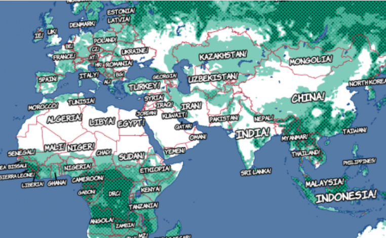


One of the major requirements for a map has always been base data to give context, situate our own data or simply to indicate the pattern that humans make on the natural landscape. Over the past few years acquiring base topographic data has become ridiculously easy through the many open and paid-for suppliers that exist. Many of these come pre-styled into designs that support a variety of uses. Many of them can be re-styled using a number of different approaches. The processes of data collection, processing and generalisation are largely ignored by today's modern map-maker. Instead, they simply regurgitate other people's data and re-style to distinguish their map from everyone else's maps. The maps above then leave it at that. They go no further and they offer no clue as to what their eventual purpose might be other than as an example of painting data.
The result of all of this artistic expression is simply that we're seeing an awful lot of re-styled versions of the same data. They are painted maps in their own right but what function do they support beyond that? They appear to exclaim that form is the end-goal and function is all but forgotten. Pretty yes, but none of the maps you see above can really be used for anything purposeful. The balance between figure and ground is so often forgotten in many of these re-styled maps as well..and the typography is often poorly integrated. Putting our own data on top of them would be pure folly.
The maps are fun it’s true. But is the exercise of colouring in data doing
anything to enrich cartography? In its simplest
form we're using freely available vector data, popular and widely available
design and production environments and then, well, changing the colours of the
vectors. What does this prove? It proves we're able to find the RGB values
of some inspirational art or colour schemes from nature and then change the map data accordingly. This is
nothing more than buttonology – a longstanding issue, debate and criticism of
digital cartography and geo-technology in general. We're losing our ability to understand the structure of the data in a cartographic sense or to wrestle with it in conjunction with typographic elements, layout or thematic overlays. We're losing our understanding of cartography.
Of course, we've been conditioned to accept that a pre-styled base map is adequate for making maps. How many maps do you see where someone puts a choropleth on top of a topographic basemap for instance? Using topographic, or reference, base maps just makes no sense for thematic cartography but it's an easy solution because it requires no effort. Actually, getting the balance between base and theme, ground and figure does require effort and should be part of our concern as cartographers. Effort is required. Effort should be rewarded but I see far too many of these painted maps get accolades they scarcely deserve.
Painted maps tend to show little cartographic quality. The re-painting of the data only illustrates the map-maker's ability to use a piece of software. There's no real generalisation
of the data; selection of data or omission of clutter. There's hardly any graphical hierarchy built in to the map or emphasis on how colours interplay between symbols or across the map. Random features get symbolised in bizarre ways simply because the data exists so it should be coloured. How could the lines be simplified or exaggerated to
the extreme but still give us a sense of the map? How might clarity or
legibility be changed and to what extent? Is it possible to invert the data in
a visual sense or play with the layout in ways the riff off approaches in art more generally? And what happens when you zoom in or out of the map...does the style update as the data is progressively generalized or modified at different scales? Rarely does any of this happen. We simple get more of it at larger scales but there's little nuance to the way the data is portrayed.
A lot of art deconstructs images and objects. Think of
how Warhol approached bananas or a tin of Campbell’s soup or a picture of
Marilyn Monroe. His art was to express the figure of his work in a new,
different way. Re-colouring data on a map doesn't go far enough. It doesn't show any sense of design acumen. Maybe I'm just getting bored of all the so-called re-imaginations of map data but where is the originality? Where is the expression? Where is the cartography?
It's always nice to play around with maps and experiment (I do it all the time) but at some point we've got to go beyond being seduced by the technology and get back to understanding of the map and the relationship between aesthetics, form and function. Learning to change the appearance of symbols is good. Goofy and experimental mapping is also good. 'Goofy and thinky' is, to quote Hannah Fairfield (of the New York Times at OpenVis 2015), far better.
It’s the thinky bit that I feel is missing from this type of
work and that the seduction of being able to use the data and do something to
it relatively easily is what counts for many. Over the last ten years or so,
the shift in time from having to collect and process all this data before you
can even get to styling it has been profound. Someone’s done all the hard work.
Actually, millions of people have done the hard work. Isn’t it incumbent on us
to honour this work and take it further than simply painting it?
I think this sort of work might be generally called
inconsequential cartography. I’d like to see more consequential cartography.
I’m all for playing with the map in artistic ways but take it further. Make a
statement. Make it say something. Make it work in concert with some other data
to create a map, rather than just changing the basemap. Give it a real purpose.
Give it a context. Marry the playful form with a function.
No comments:
Post a Comment