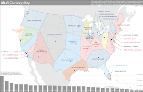
I'm a Brit. I don't get baseball as a sport. I've been to two games but it's just not cricket. So I hope that makes me an impartial viewer of the New York Times map of Baseball Nation recently published. Unfortunately I know a thing or two about maps so although I inevitably bring some subjectivity to any assessment of a map I try and look at them objectively. So to the map.
I'm a huge fan of The New York Times graphics work. They sit at the pinnacle of quality journalistic map-making and information graphics. Their Baseball Nation map has at least gone one better than the somewhat tedious current trend of creating voronoi maps of various themes - including one of baseball territories recently produced by the Washington Post (below). It's like all of a sudden people have found out about Delaunay triangulation and Thiessen polygons. Whatever next? Hexagons again?
Anyway, I digress. Having said I'm a fan of NYT Graphics work, I'm just not so sure they haven't gone a little too far on this one...
Ignoring the clumsy use of Web Mercator, the obvious problems of Alaska being so remote and enlarged (as are the territories of the teams in the northern states), and the difficulty in seeing some of the overprinted text then let's look at the map which is a weird patchwork of 'territories' of support.
Data. It's made with data from Facebook, specifically Facebook fans by zipcode. The State with the highest penetration of Facebook use is Kansas at 61%. the lowest is new Mexico with 35%. 71% of online adults, more women than men and those younger rather than older use Facebook (Pew Factsheets). So as a data source it's perhaps more representative than Twitter but it's still seriously flawed. At best it reveals some interesting aspects of Facebook use but cannot be necessarily extrapolated to represent all baseball fans. Sure, there is perhaps no other way of getting data that can give us a sense of territories and this at least gives us a picture...but as with so many of these sorts of social media related maps I'd like a little less of the map being promoted as definitive. Any map is only as good as the data. Most social media based maps should come with an extremely prominent health warning about the potential flaws before people go off interpreting the map as irrefutable fact.
Colours. The map shows the predominant support using colours broadly associated with the teams. There's an attempt to show the edge effects of dwindling/overlapped and mixed support the farther away from a team by using lighter values of colour. This works quite well but can be confusing. Reds bordering reds? Greys across the map where bordering teams are different colours? Closer inspection reveals that this represents national patterns of support for teams that are quite remote (for Yankees, read Manchester United). Some of the colours create extremely hard boundaries that perhaps are more mixed than they at first appear. When you look at the data there is often more of an even mix than any use of a single hue can represent.
Interaction. The map is simple to navigate. What works well is the hover-over tooltip that gives us some percentages of support. At least that clarifies the mix of support but the county level summary often doesn't seem to reflect the zipcode level patterns the map shows - particularly when the pattern shows a range of colours/shades. I was sometimes left scratching my head trying to figure out the relationship between percentages of support and colours on the map as they don't always seem to correspond.
I like the boundaries being named in honour of players and historic rivalries and grudges....that gives us a sense of meaning and why there are boundaries at all. A nice discussion of these is in the accompanying report. However, there are areas where current likes seem to overcome historical patterns of support. I picked up a discussion between Craig Williams and Brian Timoney on the apparent cleansing of Mets support from New Jersey. Of course, Craig pointed out that they may, of course, use MySpace and hence the data problem, though this example is tongue-in-cheek, is perfectly illustrated.
Finally...like I said, I'm no baseball fan and I don't really follow it but I was under the impression that the Toronto Blue Jays played in the league. Toronto are a Canadian team and while I wouldn't expect to see much (if any) support on the US side of the north eastern border...why is the team and Canadian data excluded altogether? Maybe on Web Mercator that would have just looked too much?


No comments:
Post a Comment