Tuesday, 30 September 2014

Pretzel crust cartography

I saw an ad on television last night that may help the understanding of how cartographers think about good map design and construction vs what we perceive as poor map design and construction. It was for a new Pretzel Crust pizza available at Little Caesars. It's constructed with a pretzel crust as the base (poor basemap for a pizza in my opinion) and then goes on to slop on a thick yellow cheese sauce instead of a tomato based sauce (odd choice, gloopy and lacking taste), before topping it off with four more cheeses and pepperoni (solid choice for a final topping but a bit out of place on the base).

Take a look and you decide whether any of this should be allowable on a pizza. The pizza appears at about 16 seconds...by 20 seconds I'd hope you won't want one...by 26 seconds I'm hoping you're wondering what the hell they were on when they invented it. If you're thinking yum, gotta go get one now then you may as well not read any more of this post.


Want a pretzel? Have a pretzel. Want cheese dipping sauce with your nachos...go ahead (though forgive me if I don't - plastic orange goo isn't that appealing even in it's correct environs). But designing a pizza using these ingredients just doesn't work for me. If it was experimental then fine...but don't release it and ask people to pay for it. I wonder if I'm alone in this or whether sales prove otherwise?

There are clear parallels to mapping. Start with any old basemap - probably a default topographic one because you don't know what the others are for or, even better, use a satellite image because that's colourful and detailed and more must be better. Then slop some data over the top. Don't pay much attention to symbol choice or design...just dump your data across the top and smear it around. Actually, make it bright because it won't show up on the satellite basemap unless it's bright. Then if you have some point based ingredients (e.g. emoji...see previous post), position these across the top. Finish off with a smear of butter and a good dose of flavour enhancing salt and boom - you made a pretzel crust map.

On emoji cartography

Thinking of putting emoji on a map? Please don't

Whatever you call them: pictograms, pictorial markers and mimetic markers have always been hugely important in cartography. Well designed graphics that are used to represent a point of interest are fundamental to topographic mapping in particular but have become vital for web maps that show points of interest across a basemap. They should be clear, unambiguous and allow us to efficiently communicate the feature with simple graphic clarity. They should work in harmony with the rest of the map and subtlety often leads to a well balanced overall map.

They're not easy to design though. You're often working with a very restricted size, perhaps pixel count and, ordinarily, a single colour. With all those constraints it's often difficult to imbue symbols with the meaning required if the intent is to support a map reader's ability to understand the feature without constant recourse to the map legend. This reason alone is why it's more common to use pre-defined symbols delivered as part of your software or available online. There are perfectly good repositories for symbols (e.g. Symbol Store, Maki) but what about emoji?

Emoji - the Japanese pictographs which have become standard in electronic messaging. They're increasingly used as shorthand for all sorts of communication.


Their increased use doesn't, however, mean they are well suited to being placed on a map. Take a look at this map, made by Katy DeCorah (click to view the live map as part of Katy's blog).


https://www.mapbox.com/blog/emoji-map-markers/

Katy's blog entry explains she was interested in exploring a technical challenge, and she succeeded. But what of the outcome? Once the technical challenge had been achieved we still need to consider whether it's useful in a cartographic sense and in this case I'd suggest it isn't though Katy did at least use a limited set of POIs and did a good job of picking an emoji that vaguely represents the feature being mapped.

In general terms these sort of symbols create disharmony. The emoji are too detailed, too colourful and too 'cartoony'. They inevitably clash with the background map and where they begin to coalesce (as they will in a multi-scale environment) they become impossible to decipher. Their style doesn't suit most cartographic work unless you have a very specific mapping project...perhaps a large scale children's atlas. They simply don't look good on a map. For balance...there are other cartoony symbols that I'd also vehemently discourage in cartographic terms. Such as:
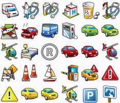

One of the tenets of the cartographic design philosophy that I was taught was to keep things simple. The KISS principle (Keep It Simple Stupid) holds true for 99% of cartographic tasks. The best advice any budding cartographer can heed is to learn how to be comfortable omitting detail in terms of the overall map and also the individual elements. Creating clean, simple lines leads to a much more harmonious map and one that is, crucially, much easier to disantangle and read. Symbol design goes a long way to creating that harmony. Just because a set of symbols is technically capable of being put on a map doesn't mean they should be.

Slopping emoji (or other 3D style, multi-coloured, shaded pictorial symbols) all over your map just doesn't work. Use them in your social messaging where a single emoji is often added as an exclamation or to characterise an emotion. Please don't use them en masse on a map...it hurts the eyes and as Kirsten Dunst might say, it's just a piece of poo (ht Craig Williams).


Wednesday, 17 September 2014

Old is new again (and again)

Cartography has always reinvented itself. This is partly as new technology matures and we're able to do things faster, better and more easily than before. We tend to experiment on tried and tested techniques to replicate them as a means of testing. Technology catches up and a map is released on the world who mostly won't have seen it before... but which can have the unintended consequence of appearing to reinvent or, worse, plagiarising to those that have. Is this a problem?

Unfortunately I was unable to attend the 2014 FOSS4G conference in Portland this year. I thoroughly enjoyed being part of the 2013 event in Nottingham, UK where I helped organise and curate the Map Gallery. I was therefore very interested in seeing how the maps have developed for the 2014 event though I had to sadly decline an invitation to help out with the judging! The entries and results can be seen here.

There were the usual mix of mashups and people simply entering re-styled Openstreetmap data. The former seems to be continuing to mature as we're moving beyond push-pinology. The latter, for me at least, is getting rather tedious. It's great that there are many tools out there that allow people to re-style basic topographic map data but that only sustains cartography for a limited time. It's painting by numbers, literally...and cartography is far more than that. It's what you do with your map and how you integrate the base mapping meaningfuly with your own or other data where something interesting happens. That leads to a third class of map...the ones that don't pour themselves into a template or use too much third party data or tools. It's in this space that we're seeing quite a bit of invention (and reinvention) as people make use of new browser capabilities or their ability to customise through code.

I was therefore delighted to see my good friend and colleague Bernie Jenny collect a couple of awards for the Plan Oblique Relief Shading work he's been doing with Jonas Buddeberg and Johannes Liem. Bernie's been doing fantastic things in cartography for a number of years. His relief shading web site and his many software tools show off some of the products of his research into the cartographic representation of terrain. I particularly like his Terrain Bender tools and his Adaptive Composite Map Projections work.

The Plan Oblique Relief web app is terrific. He and his colleagues have built a new, interactive app that allows you to play with the variables to see how the technique gets modified for European relief. Inclination, hypsometrical tints, hill-shading zenith and azimuth as well as map rotation are all supported. I'm going to assume the awards were for this innovation though there's a part of me who wonders how many of the FOSS4G attendees had seen plan oblique before? We'll never know that...but Bernie's new work, with new technology brings to life a technique that can be traced back to Xaver Imfeld's work in 1887.

Here's Bernie's map (click it to go to the app itself):


And here's Imfeld's work:


The technique has also been used extensively by Roger Smith in his fantastic maps of New Zealand:


Both Bernie and Roger have been totally open about the lineage of their work. They don't claim the technique but they've taken it and developed something new and interesting because new technology allows them to do so. This is great for cartography but...

I would like to see more people do their due diligence and both reflect on the lineage of their own work and be clear about their inspirations. I see far too many map-makers try and pass off their work as 'new' when in fact you don't have to dig too far to see that someone else has gone before. Imitation is, of course, the sincerest form of flattery and I have no issue whatsoever with people building on the work of others...but that's the point. Your work should build upon something and be clear about its heritage.

Old is always new again in cartography. Perhaps we just need to be a little more honest in appreciating that fact rather than trying to leapfrog the past and hoping our map-readers know no better. I've been caught out by this before and I claim to know a little about maps. It is incumbent on us all to not try and dupe our map readers because they will have less reason to question authenticity and lineage. Bernie and his like are excellent role models for how we should portray and communicate our work.

As a postscript I've been trying to engineer a plan oblique technique in my day job with ArcGIS. No luck yet but I'll crack on.